     (The website says to put your business card on the post, but we already uploaded it so I figured we didn't have to.)
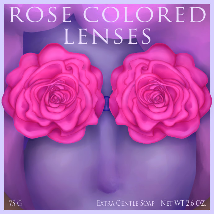
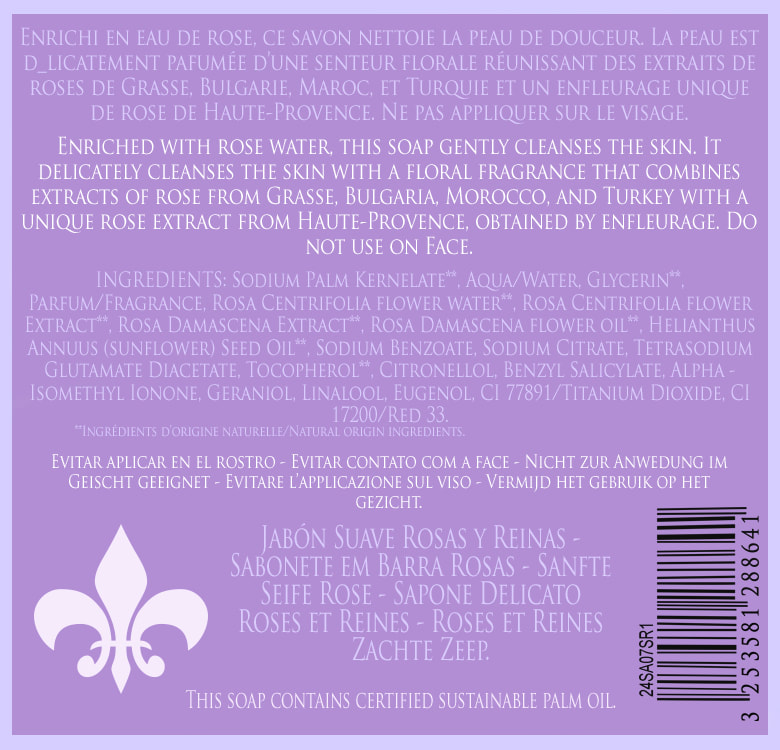
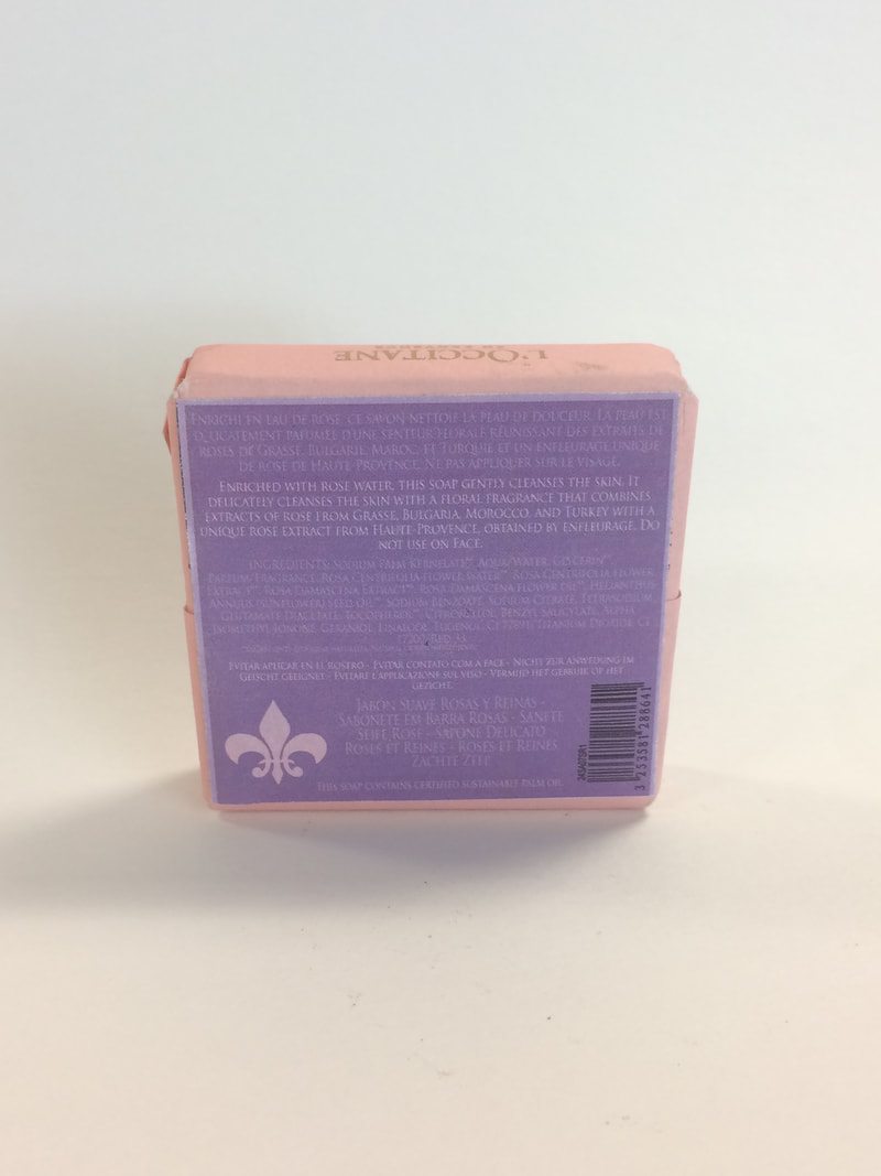
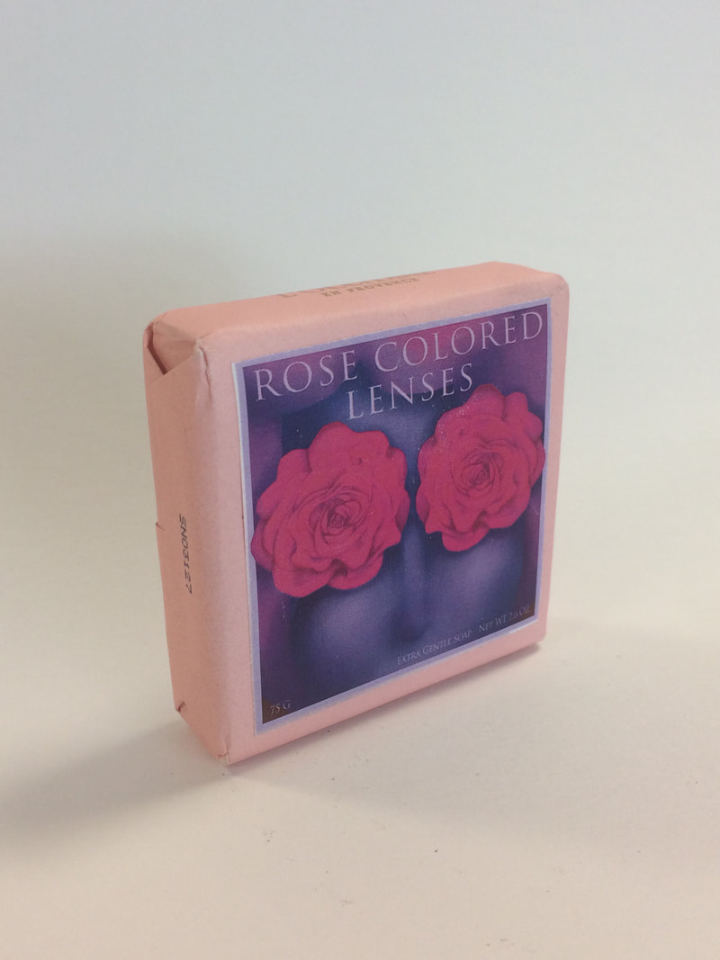
1. Why did you pick the product you did? I picked soap because it was pretty close to a square and I figured that would be easiest to measure for. 2. How did you design your piece? Tell me about your process. For the front piece, I made a bunch of sketches. I wanted it to be rose-themed because the soap was already rose-scented. I finally came up with the phrase "rose colored lenses" after I thought about every rose-related thing I had ever seen or heard and decided to draw something based off of that. I made a bad placeholder image on Photoshop and then drew/painted over it in Sai. I went back to it in Photoshop and did the outer border and some adjustments, like more shadows, color adjustments, and also the title and captions. The back sticker was just mostly re-typed from the back label of the soap I already had, with a color and format change. I also tried to make a barcode based off of the original one and added the fleur-de-lis. 3. What is most successful about your design? I guess the rose theme. 4. If you could change anything about the piece, what would you do and why? It's not professional-looking, which I can't really change because I don't have a lot of experience with graphic design yet.
0 Comments
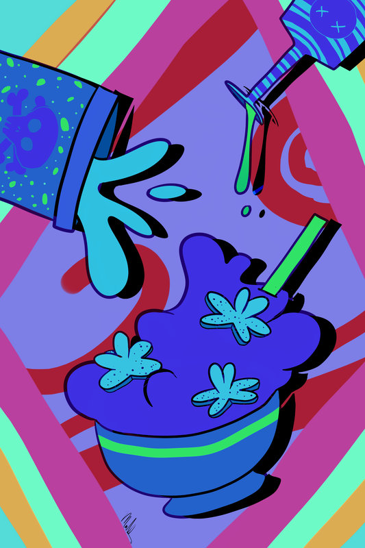
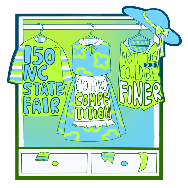 This is my entry for the NC State Fair Graphic Design Competition. I designed it for the clothing competition. I made the lineart first, and then used white, blue and green to color everything in. I used the gradient tool on the dresser background and the lineart. I made a sketch but I think I threw it out. One difficulty I had was with the lineart. My computer/art program has a problem with exporting clean images and always compresses it somehow, so the selections weren't clear. I had to spend a lot of time going back in and coloring in the areas next to the lines, as well as fixing the lines themselves. Choosing colors was also difficult because I'm always bad with color palettes.
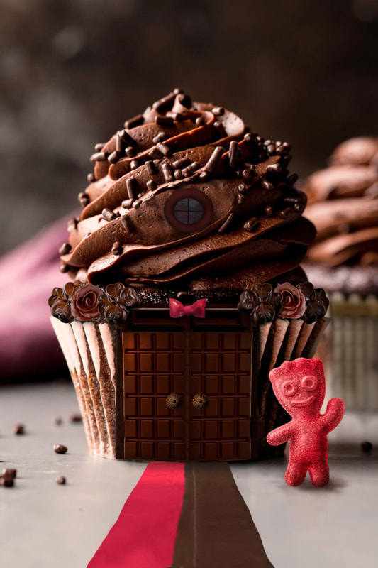 1. Who lives in the house you created? Is there a reason you picked the parts you did?
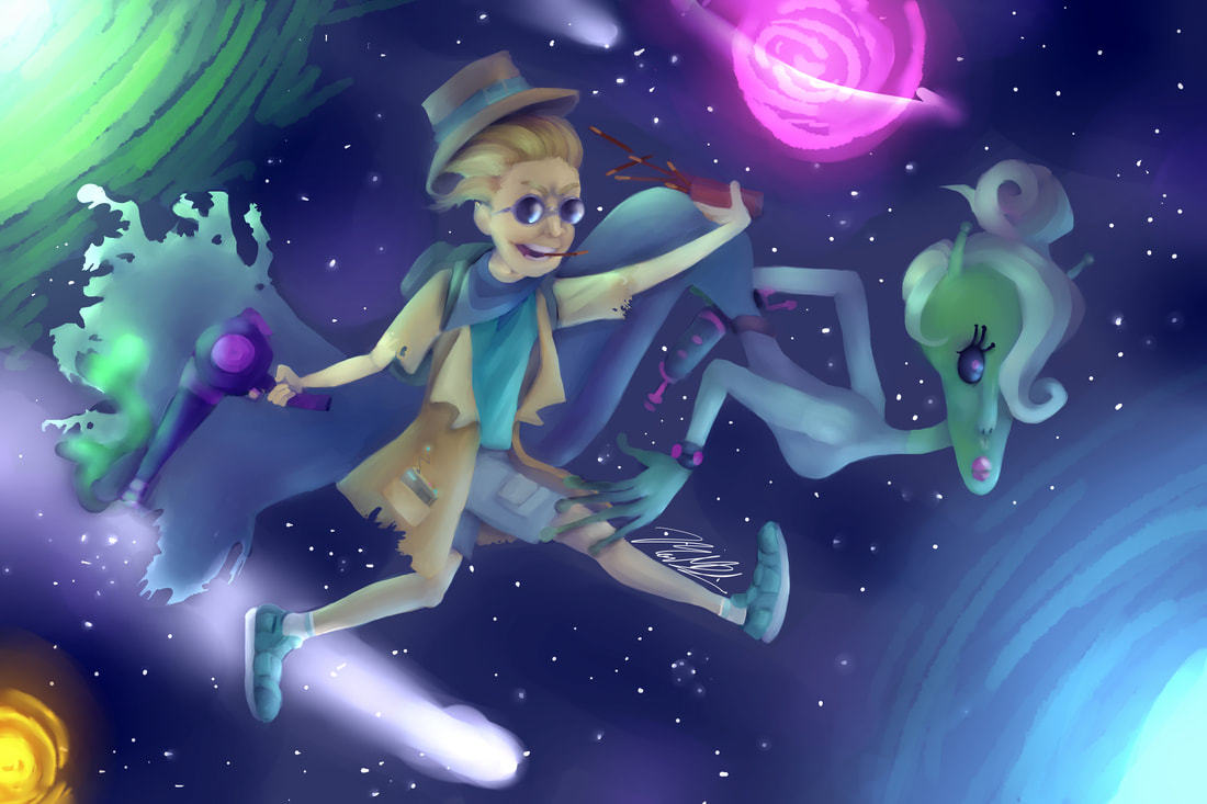
The sour patch kid lives in the house. I thought chocolate and red stuff would have a good color scheme and that a cupcake would be pretty easy to convert into a house. 2. What alterations did you have to make to make it look realistic? I put drop shadows on basically everything. Lots of dodging and burning and using the warp and liquify tools. I also used the clone tool a lot. 3. If you could change anything about the piece, what would you do? I would probably try to change the fruit roll-up road. I worked on it for awhile and it still doesn't look right to me. I wanted to center it but then it wouldn't really be centered on the door. 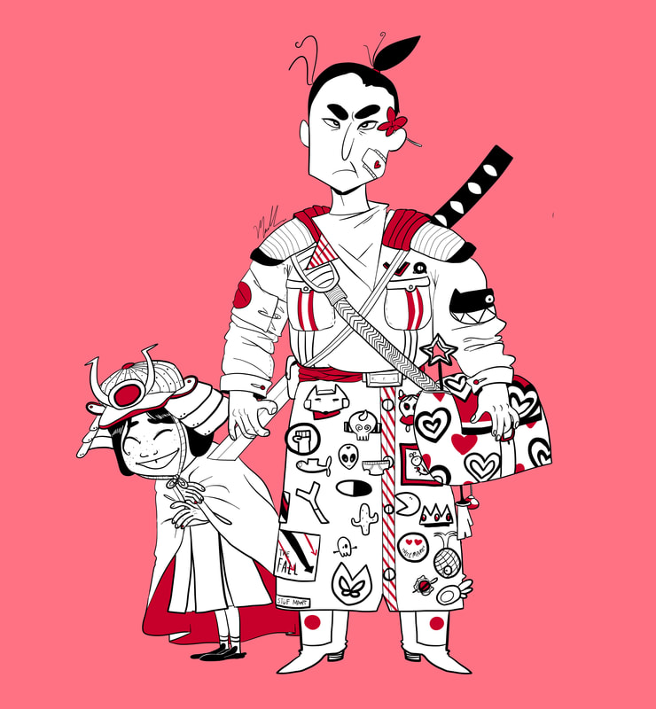 This is my Illustration Fridays assignment. The theme was samurai. I wanted to add more, but I didn't have enough time. (Sorry about any bad image quality, my computer tends to pixelate things for no reason.)
 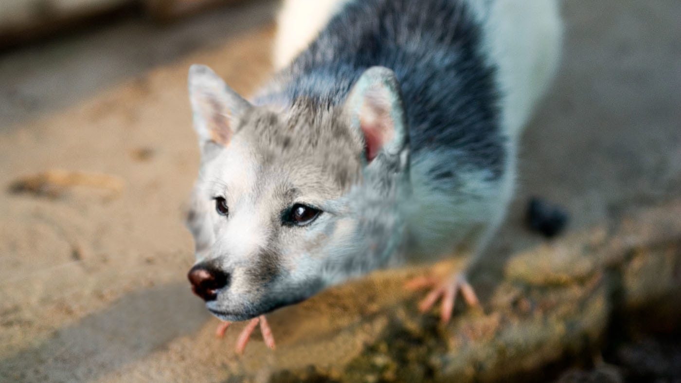 1. What problems did you overcome during this project and how?
I had trouble getting the color of the dog's head to match the color of the rat's body. The color replacement tool helped with that. It was also difficult to make it look like the dog head was actually attached to the body. I had to use a combination of the clone tool, the color replacement tool, and the blur tool to smooth it out a little. I also had a hard time covering up the rat's whiskers. I used the clone tool to fix this. 2. If you could change anything about this piece, what would you do? I would probably try to get a different angled picture of both the rat and the dog. Other than that, I wouldn't really change much. I am happier with this piece than I was with the last one. 3. Explain your animal. What is their name/species? How did you come up with this idea? I decided to combine a dog and a rat. Basically me and my friend have a terrible inside joke involving a shiba inu and a rat, so I decided to combine them for this project. The name would probably be something like RatDog. Like CatDog, but with a rat. |