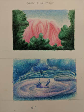
Landscape in the Style of an Artist - 5/31/18
 Sketches
Who was your referenced artist for the painting? Name 4 main ideas you used from your research to create your painting.
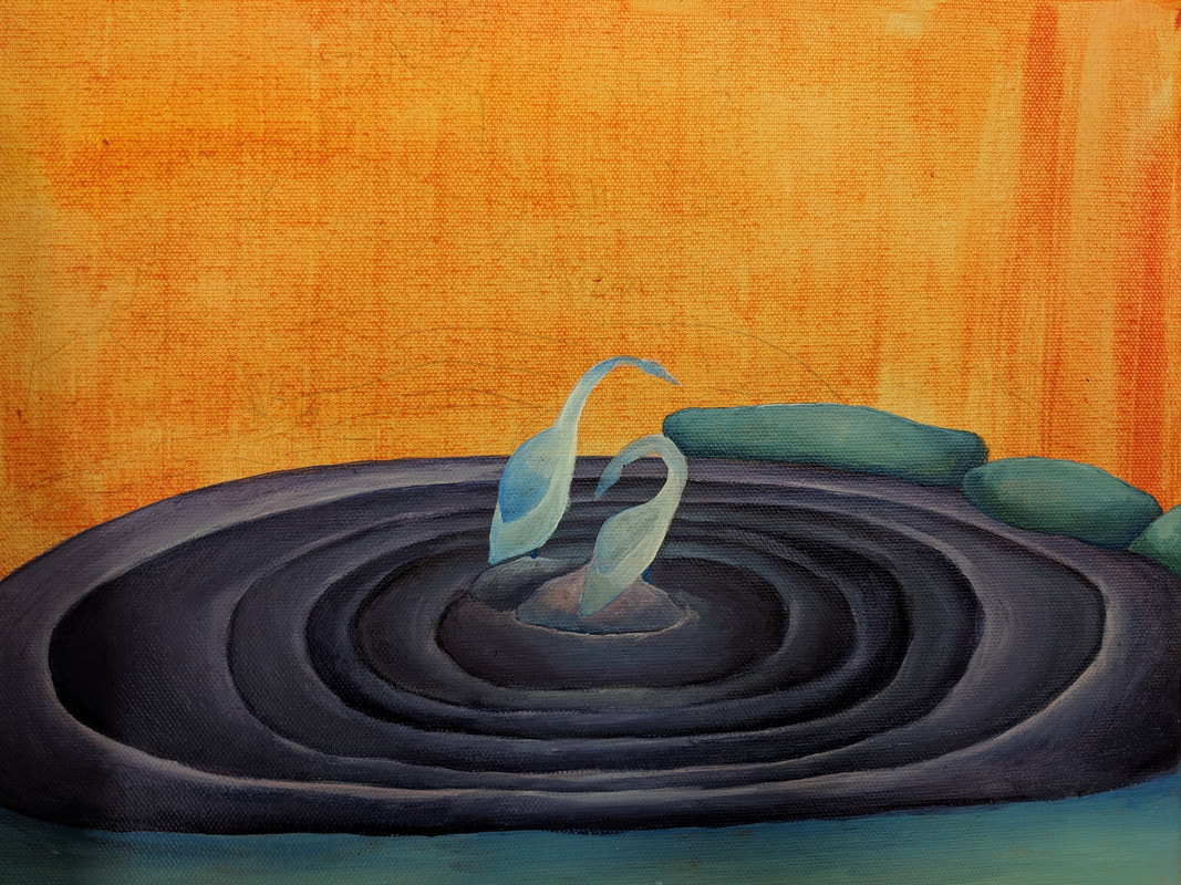
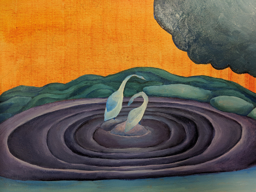
The artist I referenced was Georgia O'Keefe.
1. Smooth shading
2. Abstract colors (not true to the original photo)
3. Folds in landscape
4. Gradients
Describe the craftsmanship of your painting. (Is it neat and well executed?)
I think my painting is well-excecuted. There are some places where I wanted to get smoother lines but they turned out scratchy. I don't paint a lot so I am decently pleased with how this turned out.
What was the most difficult part of this project?
The most difficult part was mixing the colors and blending them together. I wanted to create more value changes but I didn't really have enough time to really focus on them.
Describe your color choices and how they reflect the work of your chosen artist?
I wanted to go with a cool color palette to reflect a peaceful pond scene. O'Keefe often used bright and vibrant colors that were not true-to-life. She used a lot of gradients, which I tried to incorporate into the painting.
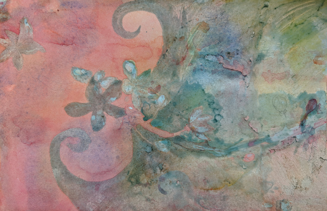
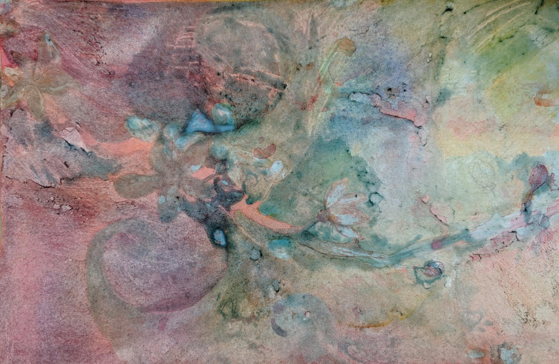
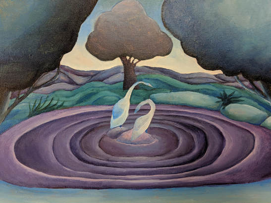 Finished Painting
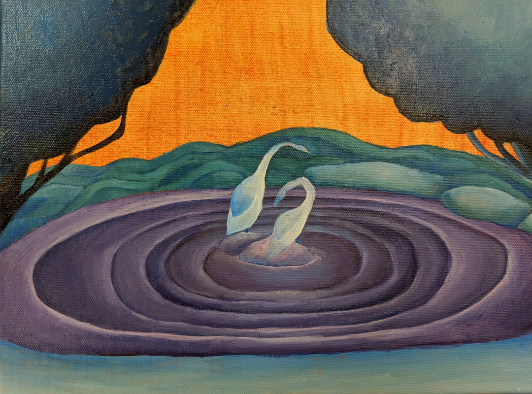
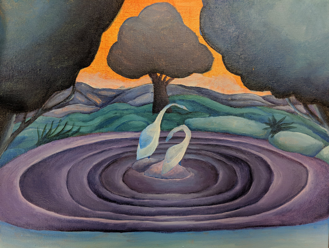
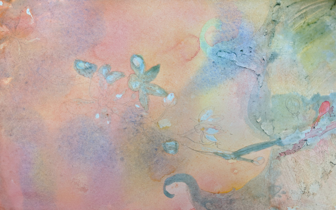
Describe how the style of your landscape reflects your chosen artist.
I tried to create rounder shapes for the trees and put a gradient to show value change on every object. I included folds in the earth behind the pond to emulate O'Keefe's style of depicting landscapes with folds in them to show the ridges.
What do you think your chosen artist would say if he or she could see your painting today?
I'd imagine Georgia O'Keefe would not be very impressed. My painting skills are not great.
What would you do differently if you were to do this project again?
If I did this project again, I would definitely do the wash later. I used too much paint for it by mistake and ended up not being able to see any of the pencil lines I had done before. If I was able to see those lines I probably would have been able to do more detail, but as it stands I basically just freehanded everything based on my original colored pencil sketch.
Square Painting - 5/14/18
|
|
This was my square painting project. I attempted to recreate the painting on the square. It was really hard because I'm not good at painting or mixing colors. Some parts look better than others (I think the yellow part looks pretty good) but a lot of it is mixed too dark.
|
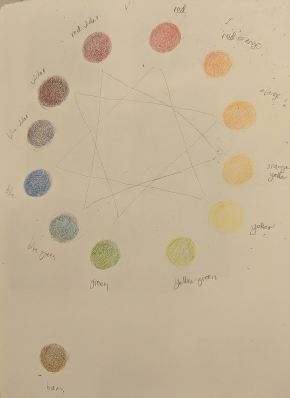
Acrylic Value Charts and Color Wheel - 5/2/18
|
|
These are my introduction to acrylic projects. I'm not good with paint at all so these were really challenging. My color wheel is a clock. I thought this would make sense because color wheels are usually circles anyways and they have twelve colors.
|
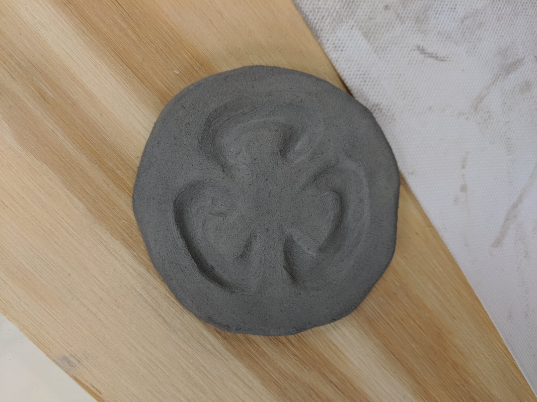
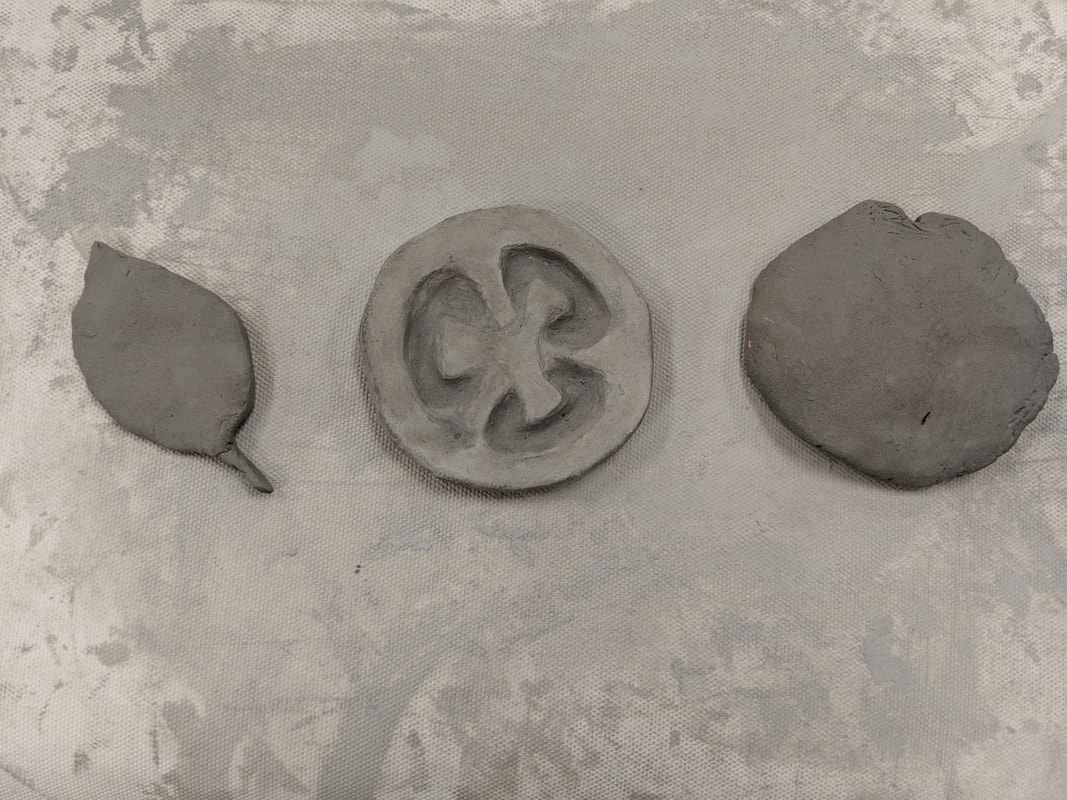
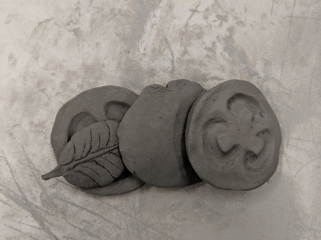
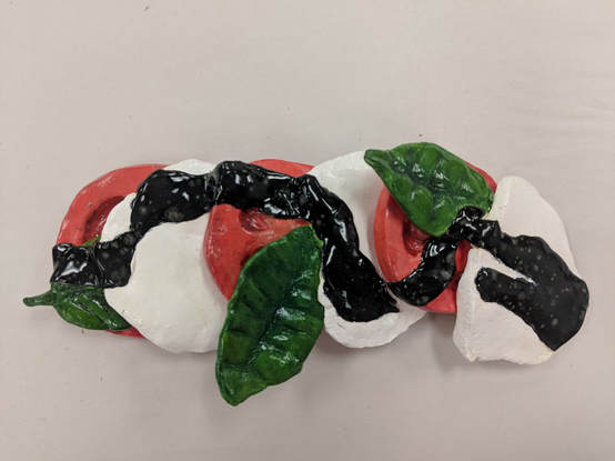
Pop Art Clay Sculpture - 5/1/17
|
|
1. Describe the craftsmanship of your sculpture. (Is it neat and well executed?)
My sculpture is neat. I think everything is pretty smoothed down and clean looking. 2. What was the most difficult part of this project? The most difficult part of this project was creating the basil leaves. It was hard to section off the leaf and smooth it down because it was so small. I think the second and third look good but the first one looks pretty bad because it was my first try. 3. Did your color choices work together harmoniously? I actually really like how the color came out. I think the color choices are harmonious and don't clash. The tomatoes might be too dull, but other than that I think it works. 4. Is your sculpture interesting from all views? I think the sculpture is interesting from all views. You can see it and tell what it is from the front and back. |
5. Describe the differences in constructing a sculpture and doing something 2D.
When doing something 2D, the piece is only supposed to be viewed from one direction. With a sculpture, the artist must account for all viewing angles, and put the same amount of effort on each side.
6. How did you create textures in your sculpture?
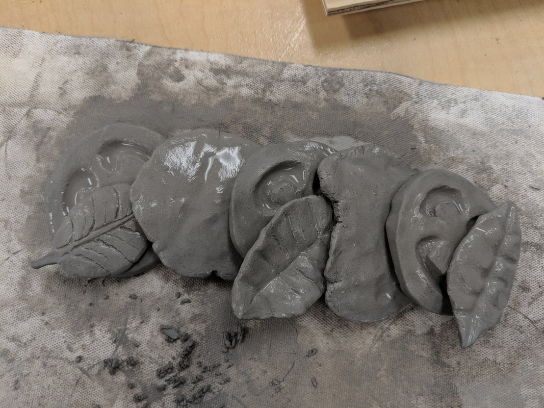
I used the small toothpick tool and make many small marks. I would then smooth it over with my finger or with a q-tip. Then I would repeat this until I was able to get a smooth texture.
7. Does your sculpture look like the actual food? How did you accomplish this?
I feel like my sculpture looks very similar to a real caprese salad. I accomplished this by heavily referencing the photos I had of the different salad elements. I also tried to replicate the textures as closely as possible, especially on the mozzarella.
8. What would you do differently if you were to do this project again?
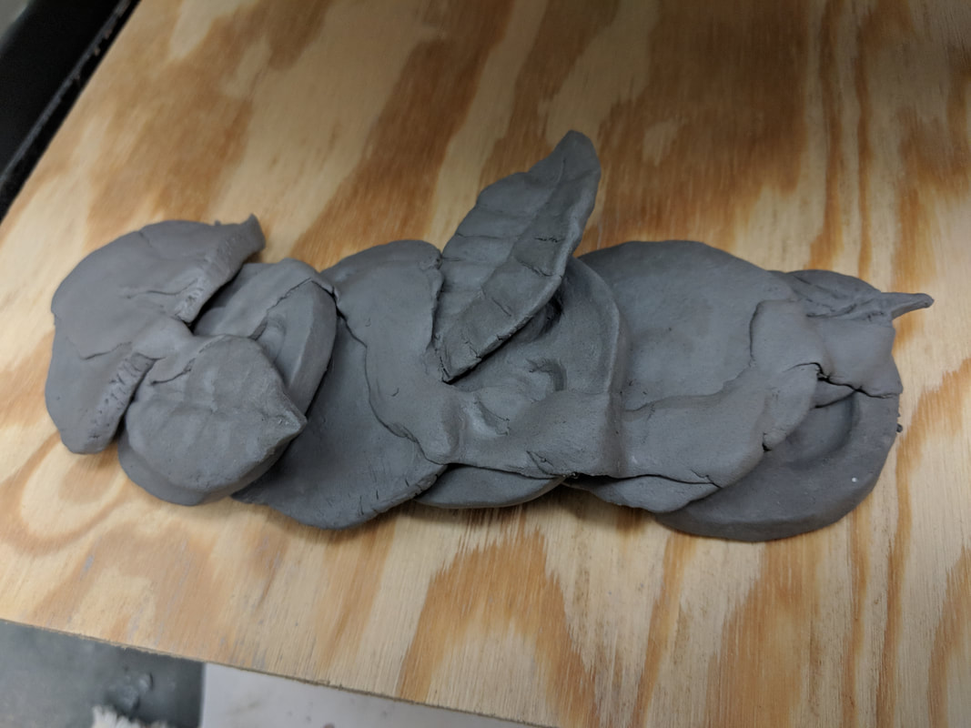
If I could do this project again, I would want to sculpt a plate and spend more time on the vinegar glaze. I ran out of time so I wasn’t really able to do these things. I would also redo the first leaf, and press the different elements all together so they would look more affected by gravity, instead of pressing them at the very end when some of them were already dry. This would better simulate the pull of gravity.
When doing something 2D, the piece is only supposed to be viewed from one direction. With a sculpture, the artist must account for all viewing angles, and put the same amount of effort on each side.
6. How did you create textures in your sculpture?
I used the small toothpick tool and make many small marks. I would then smooth it over with my finger or with a q-tip. Then I would repeat this until I was able to get a smooth texture.
7. Does your sculpture look like the actual food? How did you accomplish this?
I feel like my sculpture looks very similar to a real caprese salad. I accomplished this by heavily referencing the photos I had of the different salad elements. I also tried to replicate the textures as closely as possible, especially on the mozzarella.
8. What would you do differently if you were to do this project again?
If I could do this project again, I would want to sculpt a plate and spend more time on the vinegar glaze. I ran out of time so I wasn’t really able to do these things. I would also redo the first leaf, and press the different elements all together so they would look more affected by gravity, instead of pressing them at the very end when some of them were already dry. This would better simulate the pull of gravity.
Pop Art/Clay Study - 4/11/18
Andy Warhol created colorful depictions of celebrities and other recognizable pop culture icons. He frequently would use silkscreens to replicate a single image multiple times in one piece, showing it in different color schemes. He would recreate commercial or popular objects in this way to show their importance or glorify their presence in society.
Roy Lichtenstein’s pieces were usually comic book panels that he would recreate on a large scale, with minor changes made. Probably the most recognizable part of his style was that he would use the Ben-Day dot technique, commonly used in newspapers and comics. To create color in the image, he would paint small dots all over the image rather than paint it as a solid block. His work connected comics, considered a lower or less important art form, to paintings, which were considered to be more artistically important. He recreated comic panels and many older paintings using the thick, bold lines and bright colors that are commonly associated with the pop art movement.
Claes Oldenburg’s work were primarily focused on everyday objects that normal people would see most likely every day. He would create sculptures out of chicken wire, plaster, and enamel paint and depict clothing, food, and other common objects. Usually he would recreate the objects as large sculptures meant to be displayed outdoors. He followed the pop art trend of blowing up normal objects or common images to a large size and using bold, flat colors in their recreation.
1. Ceramics: an artform in which an artist uses clay and other materials to create sculptures
2. Clay: a fine-grained soil that can be molded into different shapes when wet
3. Wedging: kneading clay in order to force out air bubbles
4. Pinch: to create sculptures (usually pottery) by pinching and pulling the clay using the fingers
5. Coil building: a method of sculpting involving the stacking of long clay coils to form the basic shape of the sculpture
6. Slab building: a method of sculpting involving the cutting of different slabs and shapes of clay, which are then joined together in order to form the basic shape of the sculpture
7. Score and Slip: a method of joining pieces of clay, where hatch marks are cut into a piece and then a mixture of clay and water is applied to help the pieces stick together
8. Slip: clay diluted with water, which sticks pieces of clay together
9. Kiln: a furnace that fires clay sculptures
10. Glaze: a material applied to clay to create a glass-like surface
11. Plastic stage: the stage in which clay can be molded and joined to other pieces
12. Leather Hard: the stage in which clay is stiff, but can still be carved into and joined to other pieces
13. Green Ware: the stage in which clay is very stiff and dry, but can still be carved into
14. Bisque Ware: the stage in which clay has been fired once in the kiln, when the clay is glazed and can not be recycled
15. Earthen Ware: the stage in which clay has been fired twice and can not be recycled
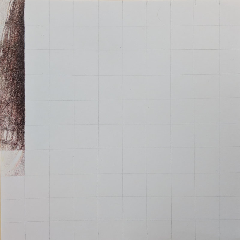
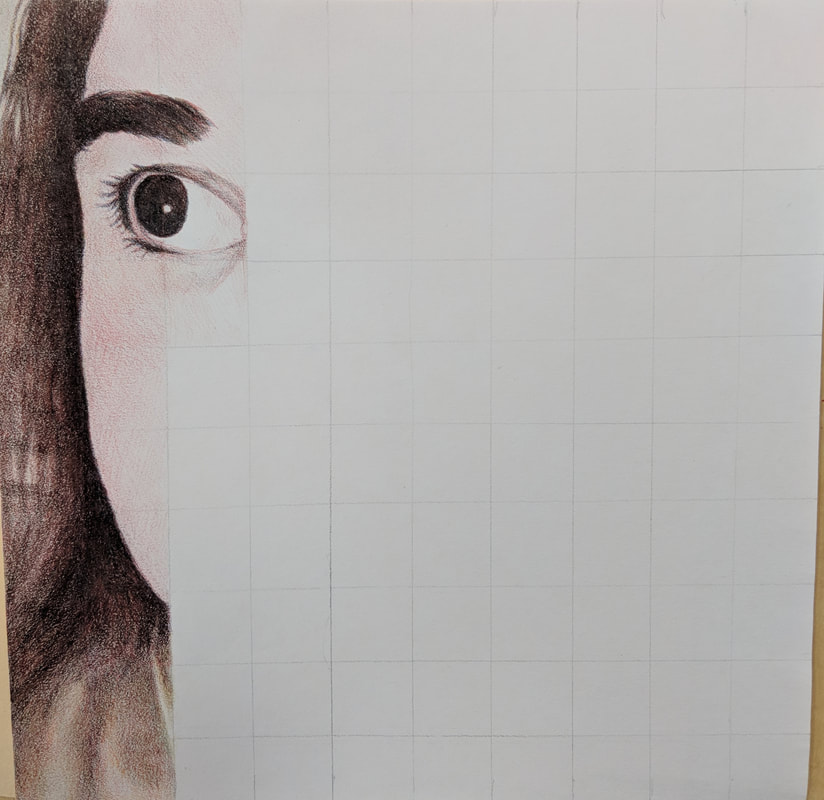
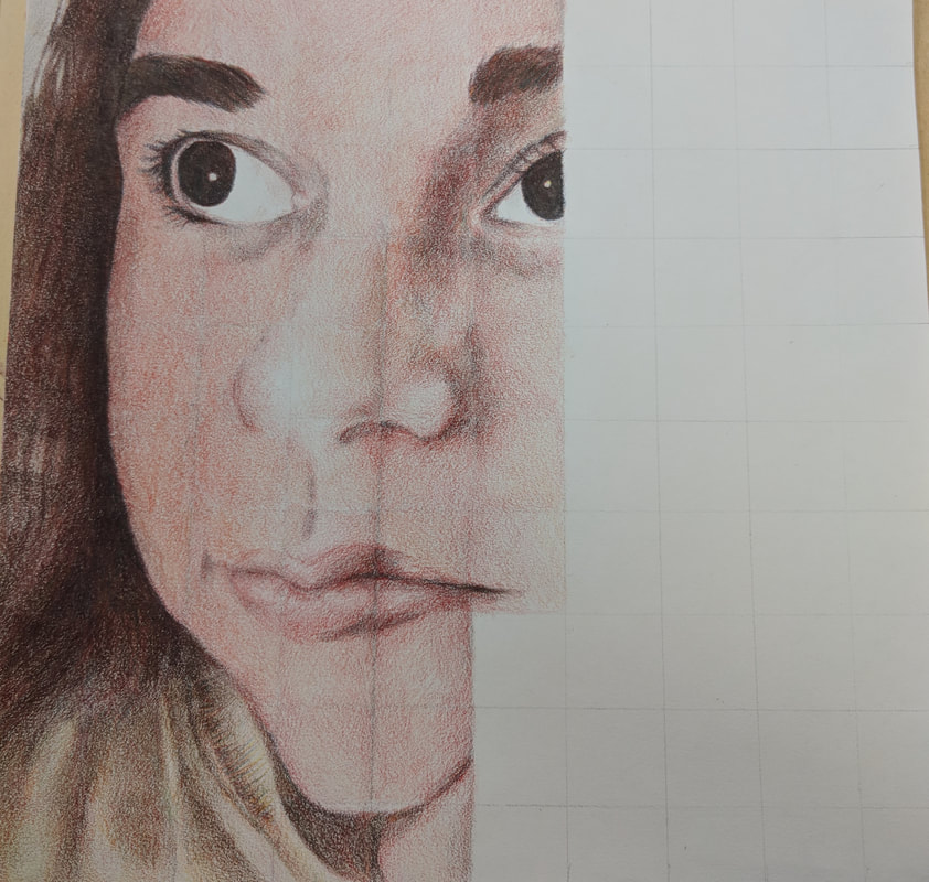
Primary Color Self-Portrait - 4/9/18
Describe the craftsmanship of your portrait. (Is it neat and well executed?)
I think, for the most part, the portrait is neat and well executed. Near the end (the right) I think I got impatient and some things may look more sloppy or not as consistent. In the middle of the image, you can see a lot of the pencil lines that I didn't erase, and some inconsistencies with the way I colored the skin. Otherwise I'm happy with the image.
Describe any difficulties you had blending and mixing your colors.
I had more trouble blending the light colors more than the darker colors. Once I figured out the skin shade I wanted, it was easier to create, especially in the areas with shadow. In the dark areas with my hair, I could layer colors more easily without worrying about making the wrong color, because of how dark the brown was. The hardest part to blend was the light area of my hair, to the right of the image, because of how light it was.
Did you follow directions and draw each grid box separately? Why is this important?
Yes, I drew each grid box separately. This is important because focusing on the whole picture rather than the grid would lead to the picture being warped or more inaccurate. Focusing on the each individual gridbox allows you to draw only what is in the square, helping you to draw more accurately.
How did you create value changes with your colored pencils?
To create shadows, I would usually put a light blue down first, then add the same colors I was using previously, but darken them. For a light color, I would start with red or yellow, and layer them extremely lightly.
Discuss how you were able to get the color you wanted from the 3 pencils?
I usually started with red and then added colors lightly until I got the colors I wanted. I mostly used red and yellow, only adding blue lightly for shadows.
How could you improve your portrait?
I would erase the lines more thoroughly and try to match the colors more in the middle of the image. I would probably also darken the skin somehow. The picture looks better in person than in the photographs that I took, I think.
Looking back do you feel you were prepared for this project? What part of the unit was beneficial in the success of the portrait?
I feel like I was prepared for the project. The texture squares project probably helped me the most. It helped me practice different patterns and designs.
Choose another classmate’s piece that you feel is an excellent example of mastering the techniques. Discuss why you feel this way.
I feel like I was prepared for the project. The texture squares project probably helped me the most. It helped me practice different patterns and designs.
Choose another classmate’s piece that you feel is an excellent example of mastering the techniques. Discuss why you feel this way.
|
|
Looking back do you feel you were prepared for this project? What part of the unit was beneficial in the success of the portrait?
I feel I was prepared for this project. The texture squares were the most helpful. They helped me practice different textures and patterns. Choose another classmate’s piece that you feel is an excellent example of mastering the techniques. Discuss why you feel this way. I feel Mason's portrait looks really good, even though I can only see it upside down. He did a really good job matching the colors of his photo and staying consistent with them throughout the squares. He also blended really well in the skin as well as in the hair and the sweater. |
Intro to Colored Pencils/Magazine/Color Wheel Assignment - 3/18/18
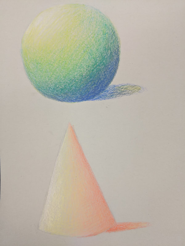
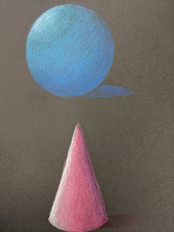
These are my introduction colored pencil assignments. I found colored pencil a lot easier than watercolor, probably because I've had more practice with this medium. I like how my value change squares turned out most of all. If I were to do any of these again, I would probably add more white pencil to the first two colored pencil pieces.
Guest Artist Watercolor - 3/11/18
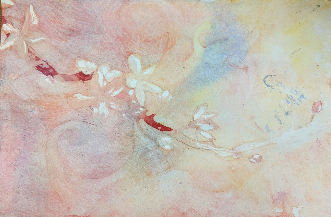
Explain the process you had to use to create the poured watercolor painting.
I would tape the paper down and surround it with paper towels. Then, I would dampen the paper by spraying it with water so each part of the paper had an even amount of water. After I sprayed the colors on and tilted the paper to spread it evenly, or added more water. Once the paper was dry, I would apply the masking fluid to the areas I wanted to keep the color of, and repeated the process once the fluid was dry.
Describe any difficulties you had with this process.
I had difficulties applying the masking fluid evenly and cleanly, and waiting for it to dry. I often applied it with too much water so certain areas with thicker application of the masking fluid would take a very long time to dry. I also did not apply enough colors to certain areas so there was not enough contrast between the different elements of the piece. I went back in with watercolor pencils to fix certain areas of the piece.
What were 4 things you learned from this project?
1. Have patience. I messed up a lot of things like the masking fluid because I wanted to get it over with.
2. Don't be afraid to apply more color. I didn't use enough pigment in this project and a lot of the details got washed out as a result.
3. Keep a clean working space. I ended up spilling a lot of pigment and probably almost knocked over the water a few times. It would probably be better to complete drip watercolor projects like this in a bigger or more organized space.
4. Use more water. I probably should have used more water in some areas so that the pigment would spread more.
What would you do differently if you were to do this project again?
I would add a lot more color. I ended up not using enough and masked a lot of areas too soon. I also would take more time with the masking fluid. I ended up messing up on a lot of areas because of how I applied the fluid or didn't wait for it to fully dry.
How did you use layers, textures, and color to create a successful piece?
I wanted to create a warmer, rosy look for the flowers, so I used a lot of red pigment and less yellow and blue. I made the branch and flowers darker than the background, so they would be the focus. I made some darker and lighter patches on the branch so that it would appear more wood-like.
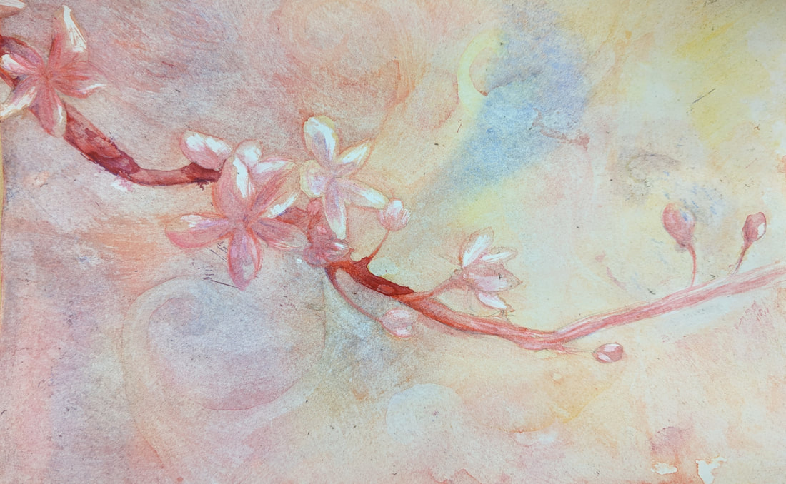
Final Artwork
|
Do you feel that the mini watercolor lessons were beneficial to you learning more about watercolor? Explain.
The mini watercolor lessons were beneficial. They helped me practice the basics of watercolor. I'm not good at watercolor at all so the extra practice helped me with value and shading. Was having a guest artist a positive experience? Explain. Yes. The guest artist was very nice and explained things simply. It helped me see new ways of approaching the watercolor medium. What did you learn from the guest artist that gave you more insight into being a professional artist? I learned that you shouldn't be afraid to experiment and try new things. He mentioned how he made some mistakes in the process of making art, and that helped me because I often am afraid of messing up. |
Watercolor Value Scale and Tomatoes - 3/9/18
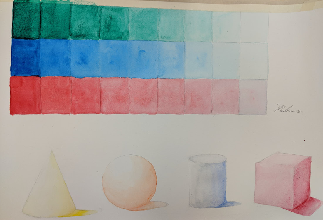
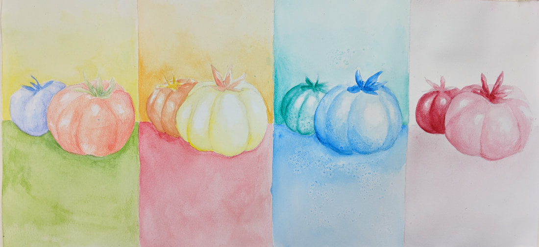
This was my value scale and shapes that I completed as part of the watercolor intro, as well as the fruit project. I enjoyed working with watercolor pencils the most. The fruit project squares are, in order, Watercolor Pencils, Warm Colors, Cool Colors with Salt, and One Color Monochromatic.
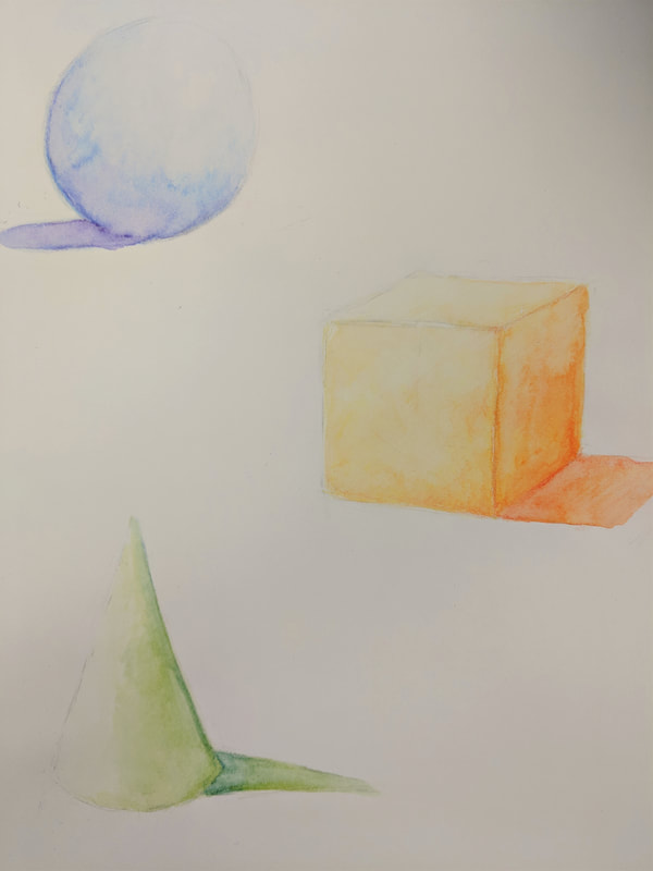
Watercolor Intro - 2/26/18
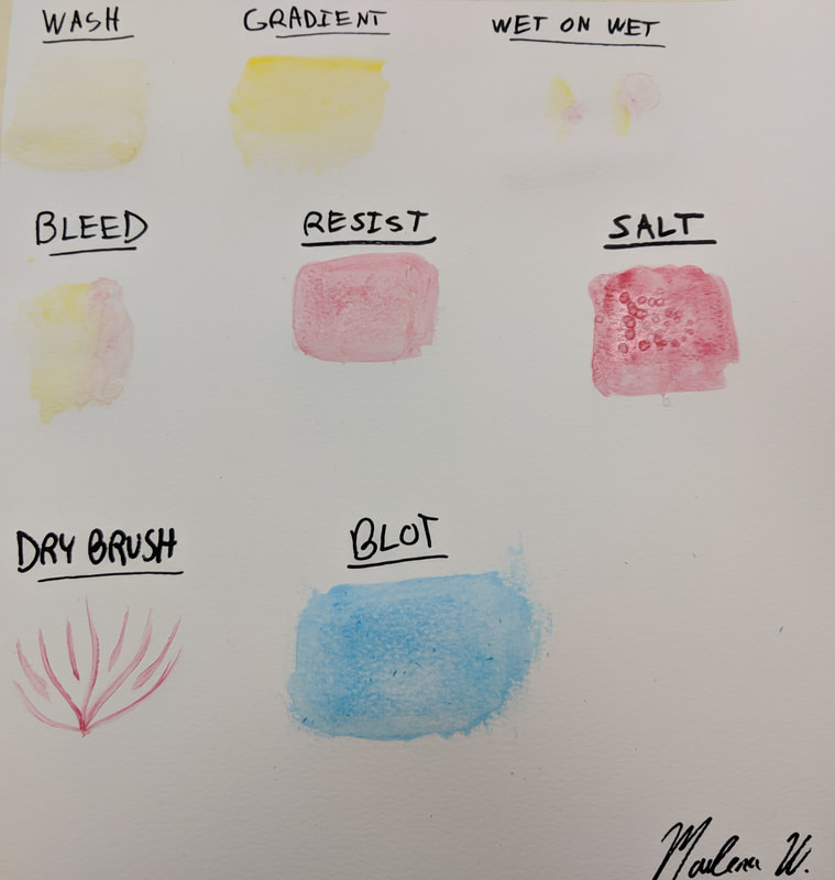
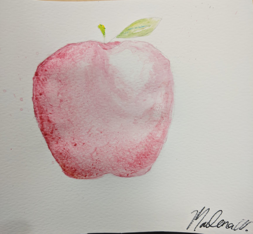
This is my watercolor techniques assignment. It looks pretty bad because I don't have a lot of experience with watercolor. I think I used too much water, especially on the apple. I was trying to show the light source and shading on the apple but it didn't turn out the way I wanted.
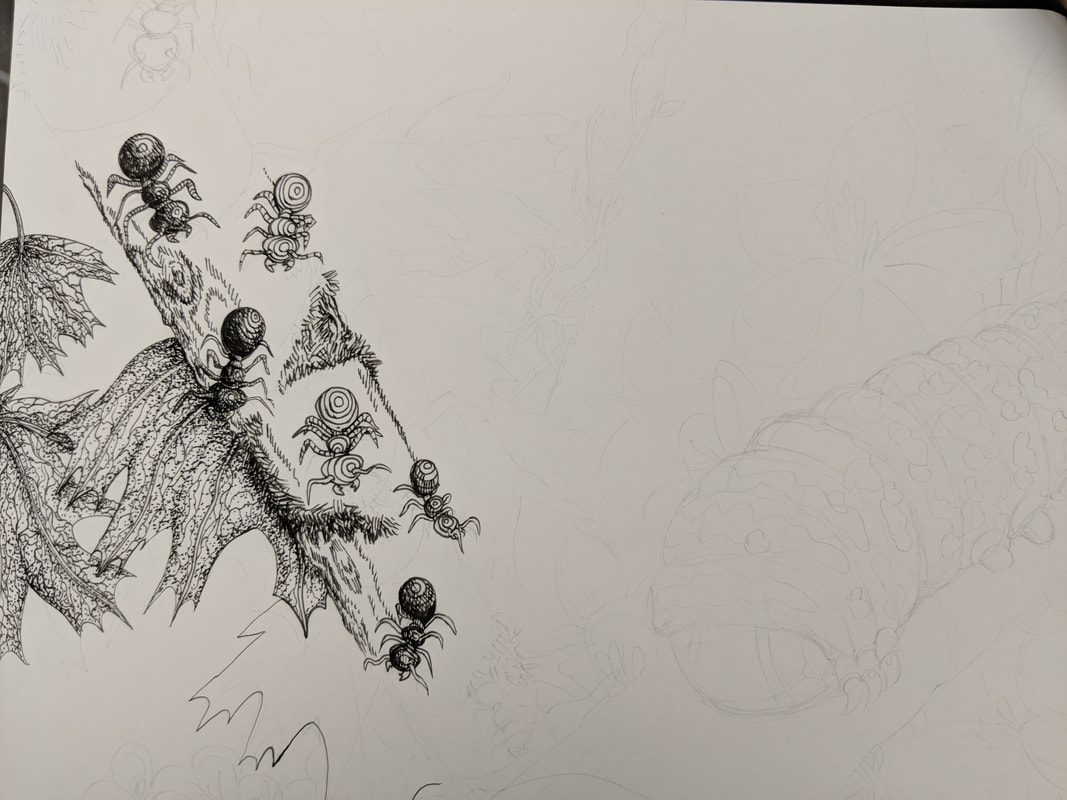
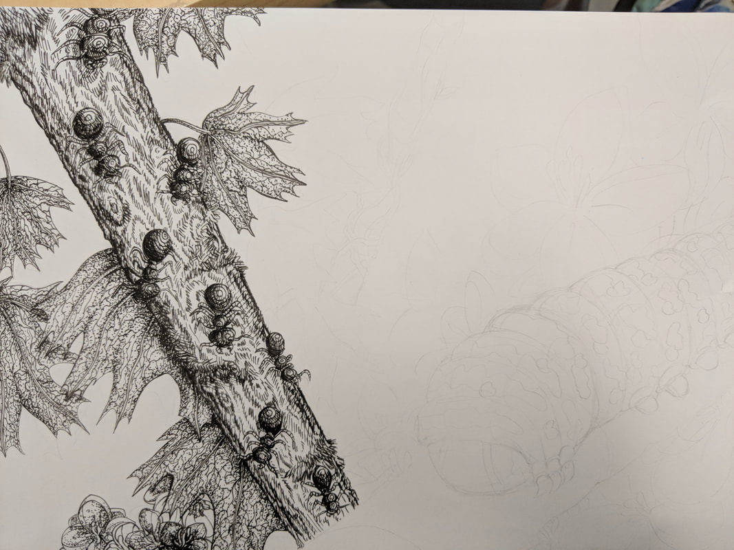
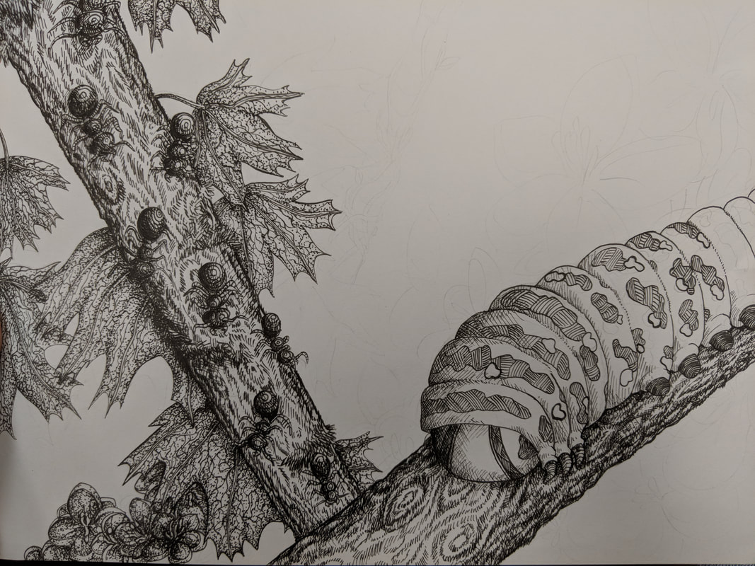
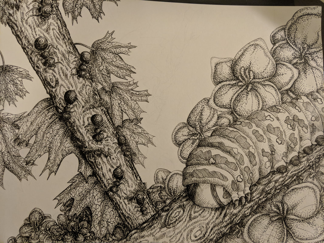
Pen and Ink/Patterning Final Assignment - 2/23/18
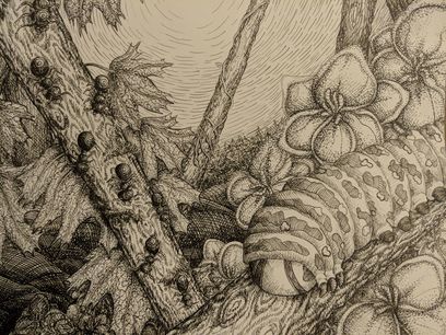 Final Artwork
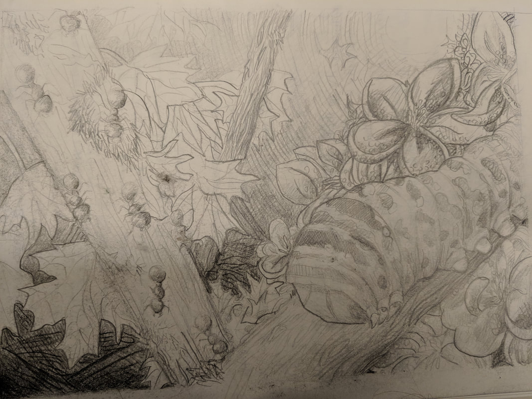
- Describe how you arranged your composition. Discuss your use of the elements and principles. Is it a successful composition?
- I referenced the videos about composition that were on the site. I divided the composition into three main parts with the two branches with the ants and caterpillar, and added other elements to show the difference between sections. The ant section is framed by leaves and is primarily dark outside of them. The caterpillar section is framed by flowers and is primarily light. The middle section is both dark and light, showing both sides. I wanted to use the rule of thirds by making the main focus, the caterpillar, off to the right, and other elements in the other two thirds of the middle. I feel it is a successful composition.
- How are texture and pattern important in your composition?
- Texture and pattern are important because they show value changes and differentiate objects from each other. In my piece, texture helps to create more three-dimensional looking objects by showing how patterns would wrap around an object. The way the textures grow more close to each other at the ends of the object also shows shading.
Value is especially important in this project because it is black and white. Color cannot be used to differentiate between different elements in the piece, so value alone must be used to create interesting contrast in the piece. Value also helps show depth and improves realism.
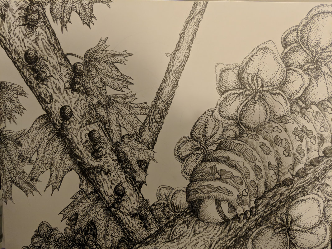
Describe your craftsmanship (How well the project is crafted technically).
I think my craftsmanship was relatively good. I managed to create shading and transitioning of value with the different pen techniques. The lines are pretty clean and don't appear to be sloppy or rushed for the most part.
Explain how your knowledge and creating practice studies with value and pattern contributed to the success of your piece.
The practice studies helped me immensely with being able to show a wide variety of textures through pen. They also helped me get used to the feel of pen. I am used to pencil, which allows for erasing and for value changes through pressure of the pencil to the paper. Pen allows little room to mess up. The practice helped me to be able to create more realistic value changes in the final piece.
When applying the pen and ink/pattern techniques why and how is it important to make sure you understand the concepts taught in class?
It is important to understand the concepts because if you lack the understanding, then your piece may fail. One of the things that helped me the most was the understanding of how to wrap a pattern around an object. The understanding of the core principles that make a pen and ink piece work will allow you to apply this knowledge to finished art and improve your artwork.
As a growing artist how do you think what you have learned will guide and better your future projects? Explain.
The core aspects of pen and ink work that I have learned will help me to experiment more and create more interesting pieces. I now have more practice and experience with pen and ink. This gives me a better grasp on what makes a good pen and ink piece. What I have learned (value, texture, etc) will guide future pieces and possibly even improve some non-pen and ink pieces I create in the future.
If you could recreate your piece what would you do differently to enhance your final outcome?
If I could recreate my piece, I would better plan what the background would look like. In its current state, it feels a bit empty and the lines look rushed. When I was creating this, I knew what I wanted at the forefront of the piece but I couldn't think of what textures to put in the background. I would possibly add some cloud textures or a sun, so that the background wouldn't be so light and empty, and go better with the rest of the piece.
Landscape Worksheet - 2/6/18
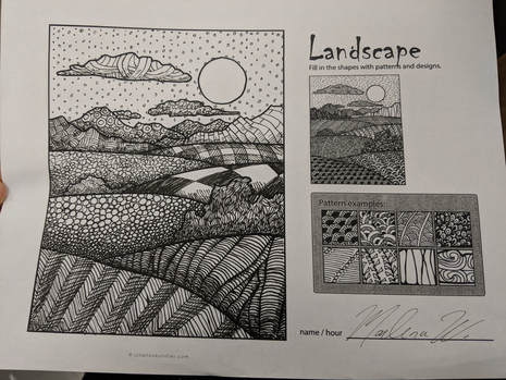
This is the landscape pattern worksheet. I chose some patterns from the 100 squares project and fit them to the hills, bushes, and clouds to try to make them seem like 3D objects. My favorite ones are probably the plaid and checkered patterns on the hills.
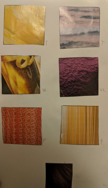
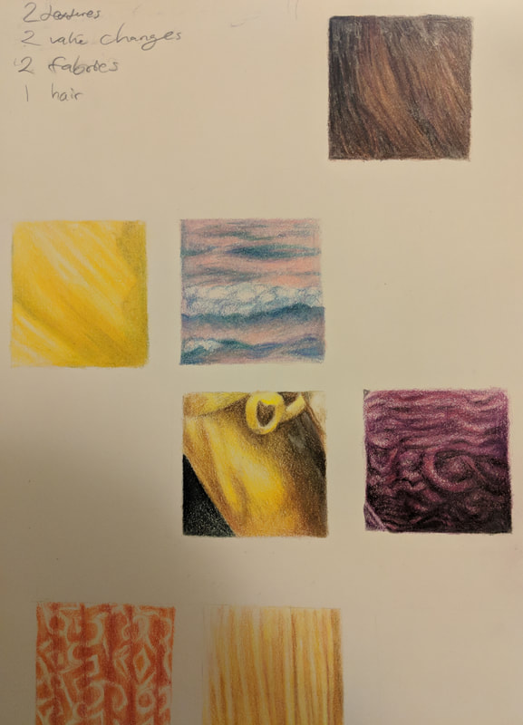
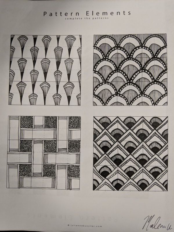
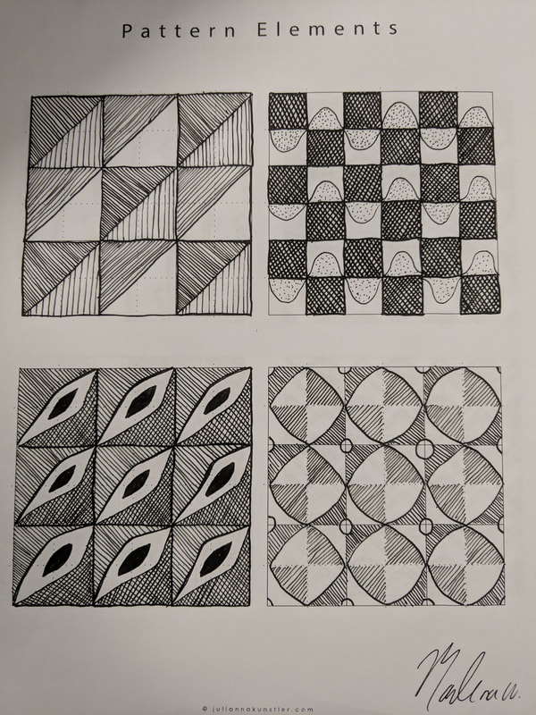
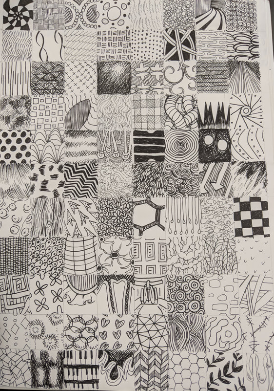
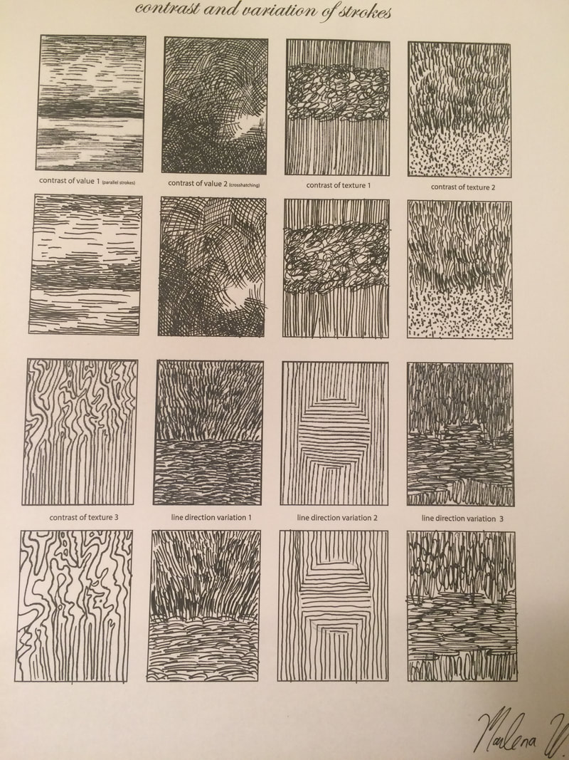
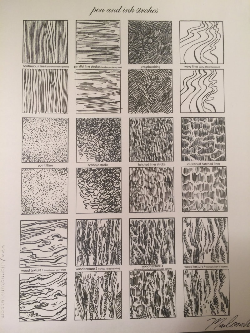
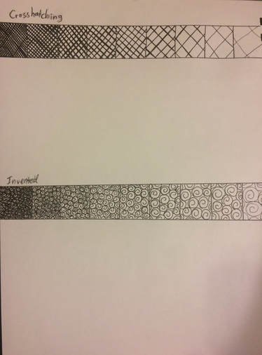
Pattern Elements and 100 Texture/Pattern Squares - 2/5/2018

These are the pattern element worksheets, as well as the 100 patterns and textures, plus the 6 extra dark ones that you asked for.
Pen Texture Worksheet Assignments - 1/31/2018
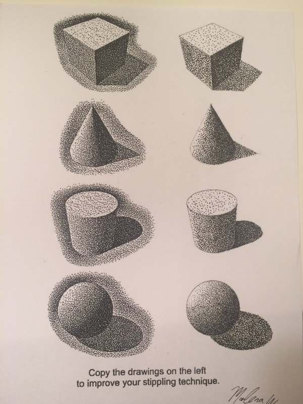
These are the pen texture and shading worksheets. I found a lot of the wood patterns really hard to copy, but I had a lot of fun with the stippling shape worksheet, and I'm really satisfied with how it came out.
Pen Shading Assignment - 1/30/2018
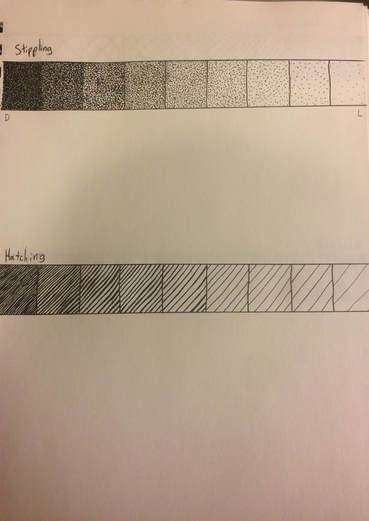
This is my pen shading scale assignment. I enjoyed the stippling technique the most, but I had trouble with crosshatching and hatching. I'll have to practice drawing straight lines. I didn't have time to start with the circle shading before you gave us the stippling worksheet so it's not on there.
Intro Assignment - 1/28/2018
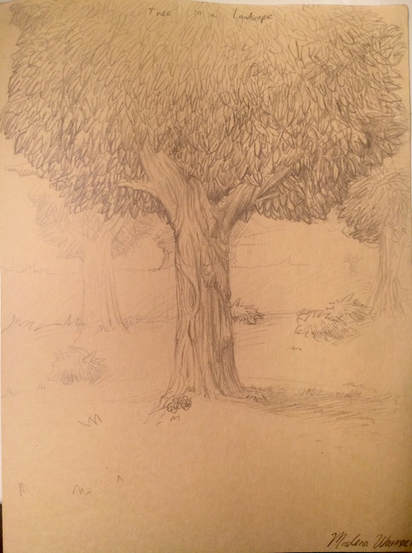
This is my tree in a landscape drawing. I wanted to draw a pretty average sized tree in a large, spacious field, with some other faraway trees and bushes in the background.
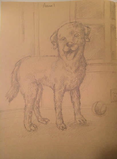
This is my animal drawing. I chose to draw a dog with a ball in a room of a house. This was probably the hardest one for me. I don't have a lot of experience drawing animals.
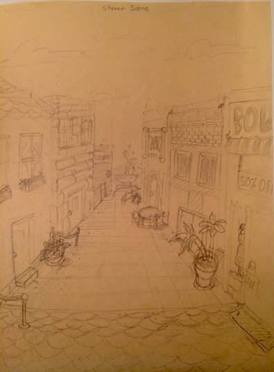
This is my street scene. I wanted to create a courtyard or city square scene, with a small fountain in the center. It was pretty challenging to work with the perspective and building design.
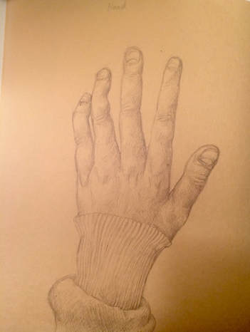
This is my hand drawing. This was probably the easiest for me, although I still think it could have turned out better. I was referencing my left hand as I was drawing with my right, so I kept unconsciously moving it and losing my original finger placement. I tried to capture all of the details on my hand, like the knuckles, my sweatshirt sleeve, the cut on my pinkie and all of the cuticles and folds.
