5/whatever day i turned the portfolio in on/20 - Piece #10 - DA END
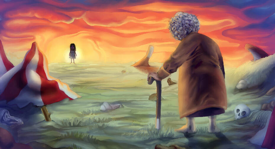
da circus died :( liek 4 respect
5/don't remember/20 - Piece #9 - Duhhhh it'sa the animals
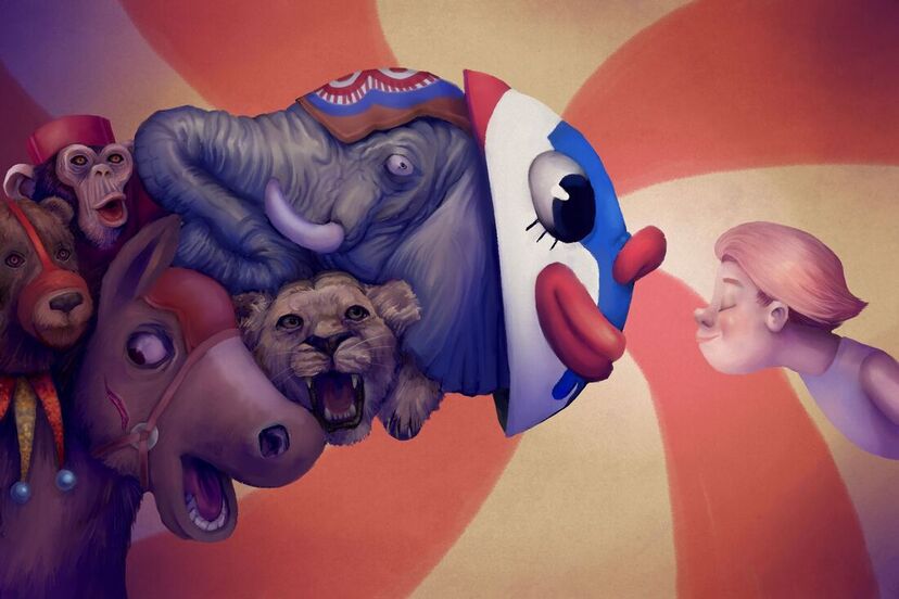
animals are abused???!!! what!!!!
5/11/20 - Piece #8 - FREAQUEZ
there are some freaks here...light in the throws of darkness! or whatever.
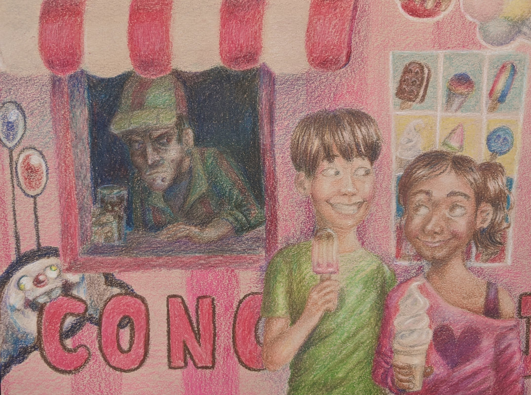
4/27/20 - Piece #7 - Concessions
Welcome back to another piece. This one is a Prismacolor piece. It looks like a child drew it but that's okay because it's done. Anyways uhhh as you can see there's two children eating ice cream or whatever and a carny in the background and you can clearly uhhhh see that he's evil because he is in the dark colored section of this drawing....umm..and he's holding poison in his hand. Because he poisoned the kids. And they will die. It's uhhh dark and stuff. It was really hard to make this piece because it took 893842387439593287543 hours and it turned out really bad. I don't know why God hates me but believe me it may not look like it but I really tried on this piece. My process for this was the same process as any other Prismacolor piece. Layer, layer, cry, reconsider living, cry, layer, layer, bathroom break, layer, layer, and done. It looks goofy. There's really nothing much to say here. I'm running out of stuff to write for these.
|
If there's one thing that really slaps about this image here that I've created it is the ice cream the kids are holding. They look good. There's no reason for them to look good but they do. Also you can't even tell the guy is holding poison. Darn.
|
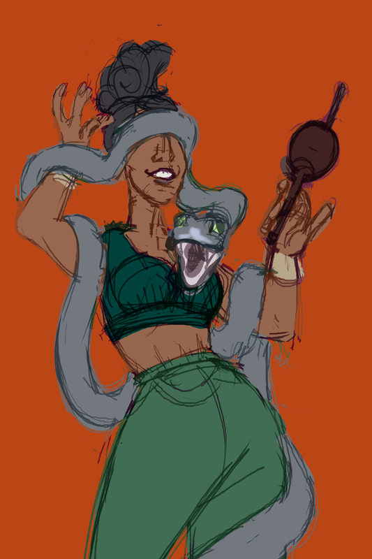
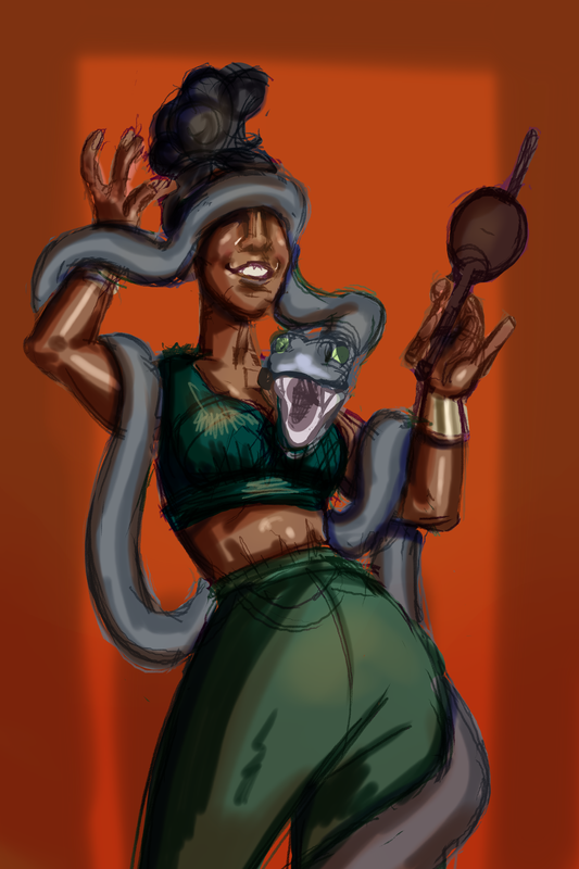
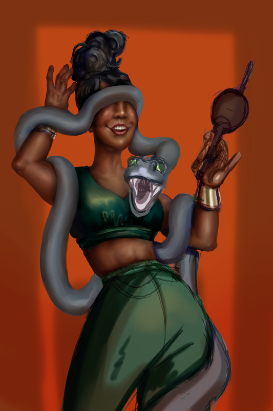
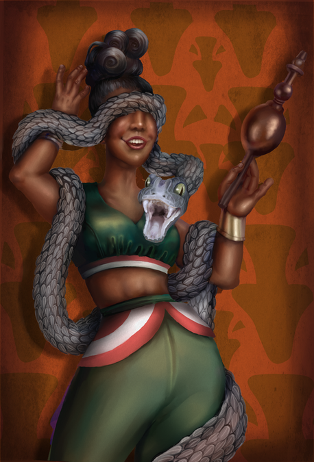
4/12/20 - Piece #6 - Snakeskin
|
|
This is the sixth piece....uh...yeah...it's digital, and it's a lady with a snake. It's supposed to be a snake charmer. I mean I guess you don't really see snake charmers at circuses much these days. But you really don't see a lot of anything at circuses these days because they are all closing. When I was five one time I went to the circus and they did this thing where a guy laid on the ground and a whole monster truck revved up and went over him but he was fine cause he was in a ditch or something. It blew my mind. I almost cried from the exhilaration. Anyways I should probably start talking about the piece now. I think this piece actually turned out pretty well. I like the colors and I think the contrast is good. The snake was weird to draw cause I hate animals (especially crustaceans, if our god was loving he wouldn't have made those demons) but I was actually surprised that it turned out pretty well, especially the scales. The metallic textures turned out nice. I would have added jewelry but I decided that I didn't hate myself that much. I'm no Sakshi, I can't paint jewelry, I stick to what I know, which is nothing because I'm stupid. If I did this again I would probably
|
|
put more effort into the fabric but I guess I wanted to keep it simple. Also I would make a better background pattern. I'm still working on perspective especially on the face but I think that here it looks okay. So the meaning of this piece I guess is just TRUST NO ONE or WATCH YOUR BACK or something deep. The lady thinks everything is jolly good, but it isn't... the snake, who she thinks she is in control of, is actually totally capable of ripping out her jugular. Or maybe it's about how even beautiful sexy snake charmer ladies can kill you? The main difficulty with this piece was forcing myself to do it. It didn't even take that long. Or maybe it did but I don't remember. Definitely not as long as the last one. Dunno what else to write. Swag.
|
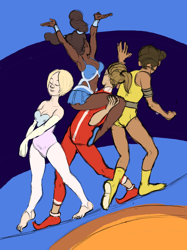
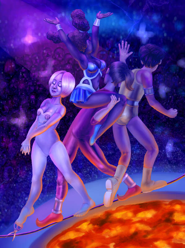
3/13/20 - Piece #5 - Delicate Balance
|
|
So this is the fifth piece. THE TIGHTROPE WALKERS! Originally it was going to be acrobats. But they're kinda related anyways. I did this one digitally, and it took 20,000 years. It has a whopping four people in it!!! Wow!!! It was hard. But it's done now. My super deep theme with this is that, we are so focuses on other stuff, like how people perceive us, how we want to act our best and get recognition for it, that we kinda forget that death and/or a devastating tragedy can happen at any moment. In the piece there are four dudes walking across a tightrope over a bucket of lava, don't know why a circus would have that, but this isn't real, anyways, we can't see any of the three back tightrope walkers faces because they are turned towards the audience, who are unimportant same-facey entities with no personality, uh, crowd mentality or whatever. It's all super shiny and so many lights!!!! But the chick in the front is actually about to cut the wire with her toe scissors. And if you look she's actually not there at all. The bottom of her legs and feet are transparent, and also she has the SKULL motif on her leotard. IT'S DEATHHHHHH!H!!!!!! But yeah I guess that's what I was going for with this piece. So my process: basically the same as the other digital
|
|
piece. Sketch, flat color, laying down lighting, and then blending everything out for the next two decades. It was really hard because of how I had to put details on four different characters, so you can see that the first one is a lot more refined in terms of more contrasting shading and shine and yadda yadda yadda, basically I just got tired of the Grind, but my excuse is that I feel like our focus is more on the person in front anyway, so the others are a bit more background than she is. One thing I think is totally bad about this is the background, I tried my best, but basically halfway through I accidentally merged the background and foreground layers and when I noticed, it was too late to undo. So I did the best with what I had. I tried to imply more details and add textures and lights but it still looks pretty goofy. The lava looks decent but I didn't blend it out that much cause I was afraid I would lose the bright colors and also because I wanted to go to bed. But some places where I worked on shiny stuff (the hair and face of front lady, blue lady's clothes, red guy's pants) I'm pretty proud of and I think they turned out good, especially since I haven't really tried that before.
|
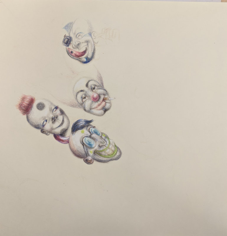
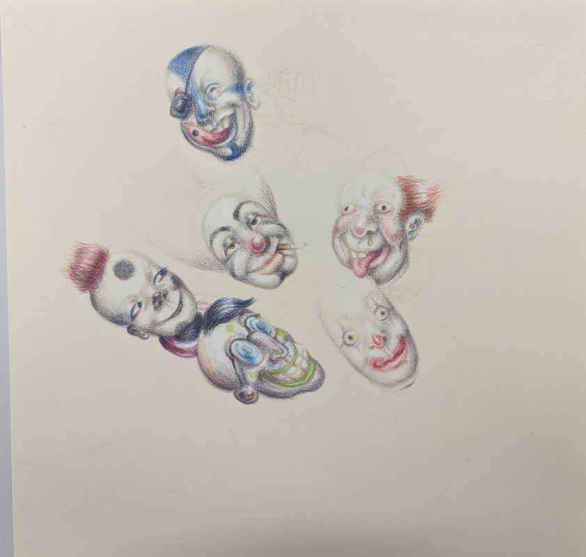
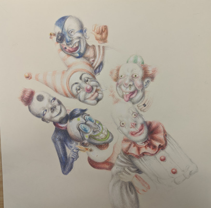
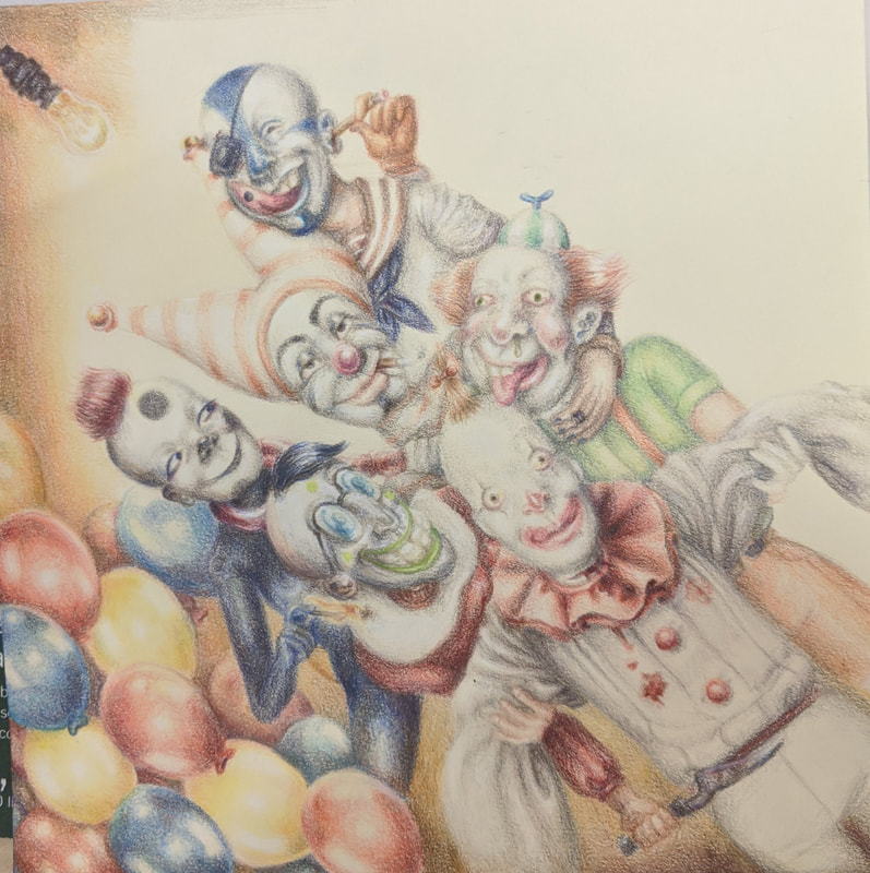
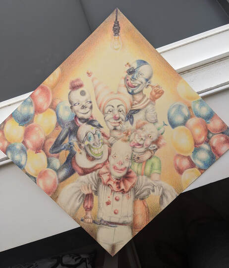
3/7/20 - Piece #4 - WE ARE ALL CLOWNS.
|
|
"In this circus of a society, we are all clowns" - Socrates
This is a funky little doodad of a piece I did with Prismacolor pencils. The final picture looks kinda bad because I dunno how to crop it. Cause it's supposed to be like a diamond. But we can work it out later. So this piece has a lot of things I tried to put in it. Basically each clown is doing something violent to another one. LET ME LIST THE ACTIONS! Bombo Jimboloony in the front is actually DEAD. You can see that he is actually being held up by the two clowns on his sides. His throat was slit by Fawfulino on the left who is holding the knife (the metal texture sucks on that but we have to learn to live with our mistakes). His weird Shakesphere neck thingy is being lit on fire by Dot the Girl Clown. But a balloon noose is being wrapped around her neck by Stiffy Suspenders on the right (who is helping to hold up Bombo). He is being choked by Eyepatch on the top right, who is getting a pencil stuck in his ear a la that one Butthole Surfers album cover by Blobby the alpha clown who is in the middle. BERSERK!!! The more I look at this the more I like it, although I think I should have tried to use a |
|
blender cause I have problems with not layering until everything is waxy but it looks fine anyways. The balloons on the sides are supposed to act as a border. I think the theme of this piece is to not take things at face value because weird stuff may be happening if you look close enough. I mean you got a bunch of family friendly clowns here but they're all trying to kill each other, and one's dead already. So yeah. I liked designing all the clowns and I think they are different from each other enough so that they don't have sameface. I guess I just like drawing violent and weird looking people. This piece took a long time but I think it worked out.
|
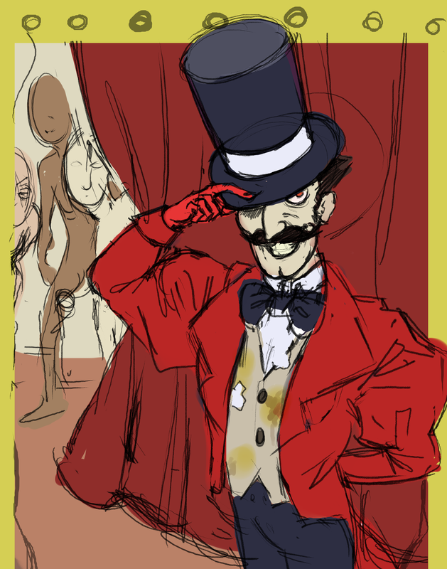
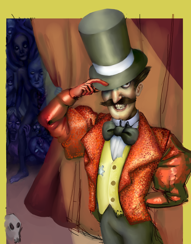
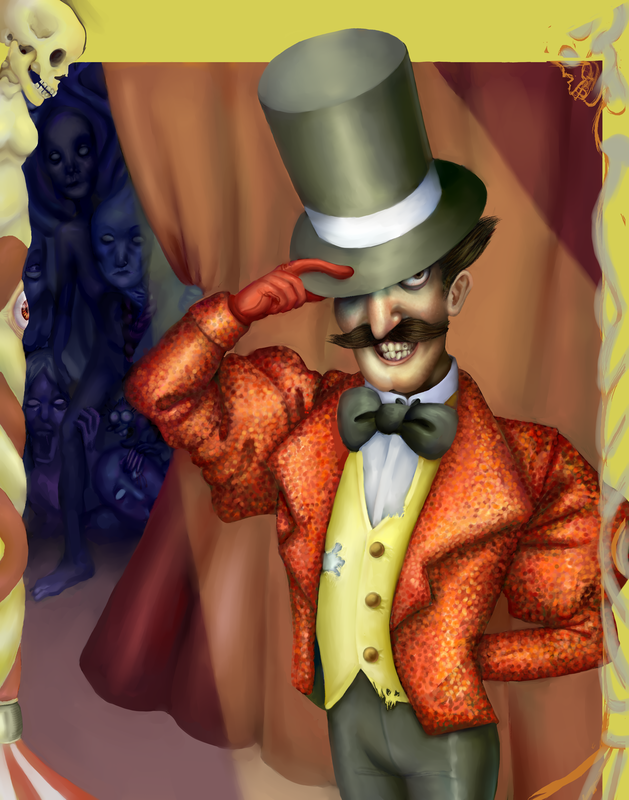
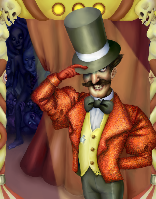
2/18/20 - Piece #3 - Skeletons in the Closet
|
|
WOWOWOWOW it's my third piece!! Ace!! So this is a digital piece obviously. I have a lot more practice using this medium. This piece is centered around the RINGMASTER of the circus. My general idea for this piece was to make a guy with really showy clothes and demeanor but he's really super dirty and weird. I tried to show that with his stained/ripped vest, gross teeth, scary looking eye that gets hidden by the shadow of his top hat, etc. And then, behind the curtain, there's a bunch of weird looking soulless people, and Miss Marbles. This was supposed to reinforce the general idea of my concentration, BREAD AND CIRCUSES, where there's some glitzy stuff distracting you from the dark stuff. I continued the skull motif I keep putting in in one of the rips in the vest, and of course the two sexy skeleton things in the upper corners of the border. Since I can do a lot of detail with digital work I wanted to try and add in as many small little things as possible, so that maybe the viewer could see something new each time. Since I am a amateur high school student, I'm not sure if I succeeded with that, but maybe I did it at least decently well. It's a start. Anyways, now I should probably talk about my whole process with this. So first I did the
|
|
composition sketches, which always end up looking the best out of anything because I'm way better at sketching than doing a finished piece. I tried to capture the dynamic angle in the finished piece but honestly I don't know if I succeeded. Anyways, from there I did a color sketch where I just put down some flats and then cranked out like 20 sloppy multiply layers to get the general idea. For my process on the final, i sketched it, then added flat colors. After that I did a lot of lighting and shading layers, and then I spent the next eight hours smoothing that all out. For the sequins on the jacket, I basically just did a crapton of dots in different colors to try and mimic the textures. In regards to clarity of each different part of the piece, I think I did a decent job of making everything have contrast and enough shading around the edges to make it stick out. I also think the jacket turned out better than I was expecting. So I think this piece is successful in what it was trying to convey.
|
69/whatever/20 - Piece #2 - Entrance
|
|
This is definitely the worst one I've done. It's been in my closet for weeks and weeks. I wish I could start over honestly. It reminded me that I actually don't know how to paint or draw scenes or anything really. I hate it. Now that I'm done ranting, this piece is supposed to be about some blokes entering the circus. They're all lined up with their tickets and stuff. It's supposed to be like an idyllic 50s scene cause you always see 13 year olds online talking about how they wish they could go back to the 50s cause they had soda parlors and stuff. And I think in general that the 50s are way too romanticized. The main thing with this is I sort of wanted to make it so the scene centers on the kid and his mom. And as you get further away, the colors get cooler, the faces are blurred, and the grass dies. And also a storm is forming in the sky. And there's dudes fighting in the background. It's like a nostalgia thing where people only remember what they want to see. I basically failed at everything I tried to convey with this piece and honestly it's really embarrassing. Like I legit can't paint I don't know why I try to delude myself. There's a lot of shortcomings...but were there any successes??
|
|
Well my favorite thing about the piece is the mom. I think she looks like every 50s mom ever. And the clouds look good. Nothing else to say really. But they can't all be zingers. So maybe I learned a lesson about accepting failure and moving on..........?
|
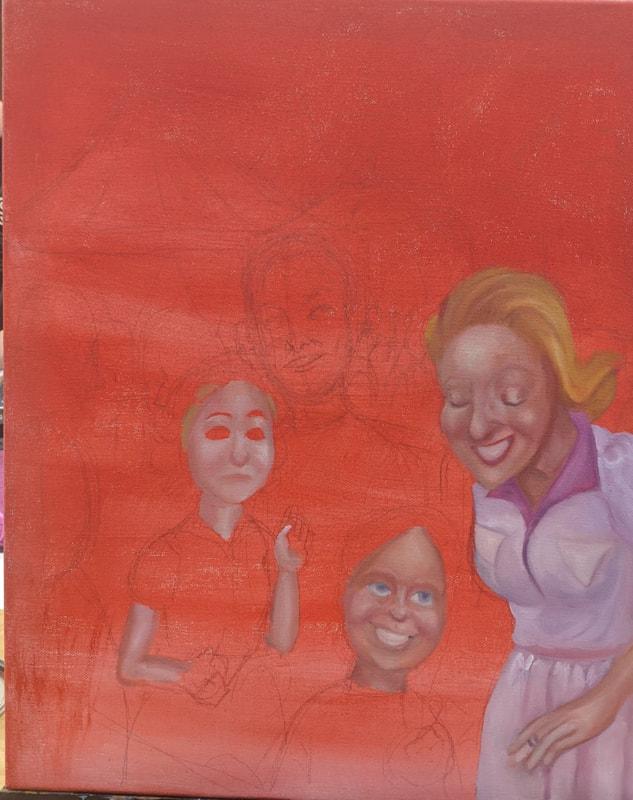
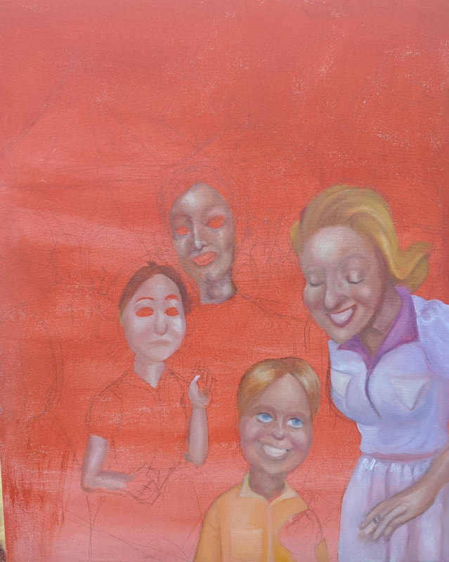
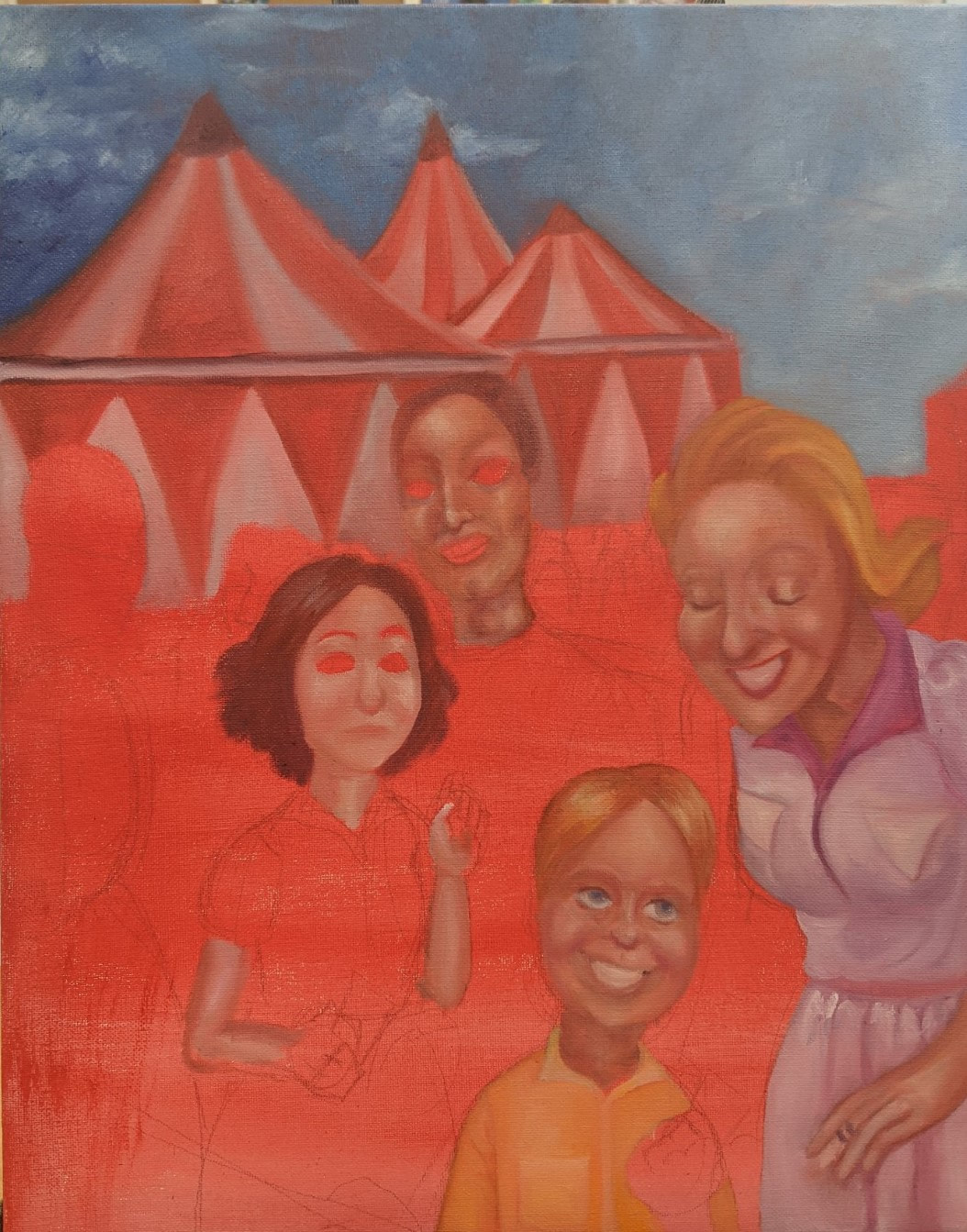
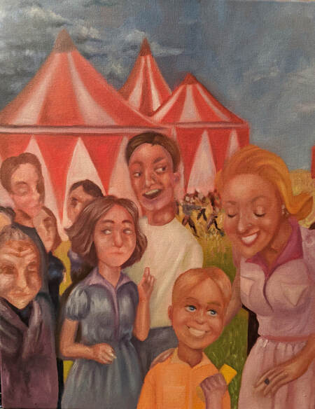
2/2/20 - WEEKLY UPDATE ONE
According to the Powers That Be I must make a Weebly post updating you, the reader, on my progress through life and my portfolio.
It's been challenging. The next piece I am working on is of a bunch of people walking into the circus. It's an oil painting. So far I think it looks like trash but that's what I always think anyways. It's supposed to express the euphoria of going to the circus with your bros, cause it's super fun, but also there's crazy stuff in the back, and also everything outside of the main two people are kinda blurry. Yeah. Am I supposed to have pictures for this?
It's been challenging. The next piece I am working on is of a bunch of people walking into the circus. It's an oil painting. So far I think it looks like trash but that's what I always think anyways. It's supposed to express the euphoria of going to the circus with your bros, cause it's super fun, but also there's crazy stuff in the back, and also everything outside of the main two people are kinda blurry. Yeah. Am I supposed to have pictures for this?
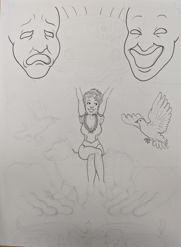
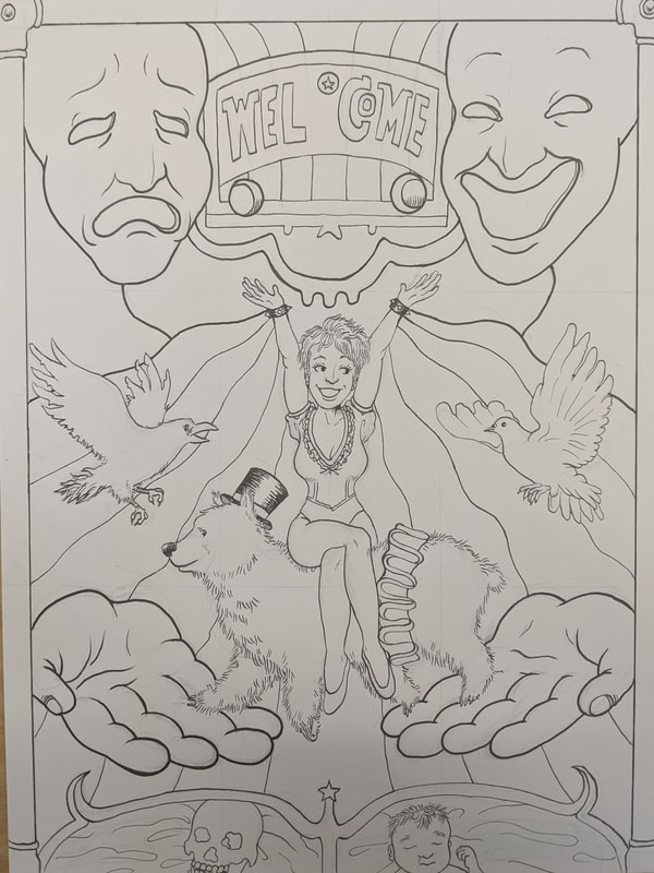
1/30/20 - Piece #1 - Welcome.
|
|
Okayyyyy so this here is my first piece for my AP Art concentration, which is BREAD AND CIRCUSES I wanted to make a sort of poster so it's kinda like you're seeing this and you're like "oh wow I'm gonna go to the circus now" and you do and that's the rest of the concentration. So in this I kinda wanted to set up the themes of the concentration. I was inspired by old circus posters for most of this. There's dark side and a light side to the poster. FOR EXAMPLE. The raven, the skull (at the top, and at the bottom on the left), the blood on the bear, all that stuff would be dark. And the light would be the dove, the baby, etc. I wanted to have different opposites on each side too, like the bear having both male and female clothing, the sad and happy drama mask guys, stuff like that. I used pen and ink to make this. It was better than last time but still traumatic. Hmmm I wanted to keep the colors lighter, some areas are brighter than others obviously but for most areas I wanted it to be more
|
|
of a wash so that you couldn't see my brushstrokes because I do not know how to use ink or any medium really. You can see the juxtaposition of different elements of dark and lights on both sides. I want to continue that theme through the rest of the concentration - like, dark stuff that you don't really see at first because you're caught up in the euphoria of the moment. Woah! Crazy! We love the deepness! I really feel like I have nothing else to talk about here. Overall I hope that everything else turns out better than this piece cause I don't think it's that great, probably because I used pen and ink and I'm really not that good with that. YOINK! Over.
|
