Art 4 Reflection
|
I AM REFLECKT'ING on ART 4 or AP ART FIRST SEMESTER.
Overall I did not really enjoy the projects we did. I wouldn't really pick out one project that I particularly liked or disliked, they all blend together to me. My most successful pieces from this class would probably be the reflection and the interior space one but I don't really like those ones either. In my eyes I didn't really see a significant progression in my skills in any area. I can't really pick a worst piece. I think it would probably be the self portrait because I don't like self portraits and I don't like acrylic either. Working with it was hard and the final painting looks kinda stupid. It will be going into the back of a closet with my other paintings. I really don't have anything else to say. But I am more happy that we can direct our own projects next semester even if it will be extremely stressful to do fifteen pieces in fifteen weeks. I think I will be able to better show my skills and creativity that way. |
1/8/20 - Palette Knife Portrait
|
|
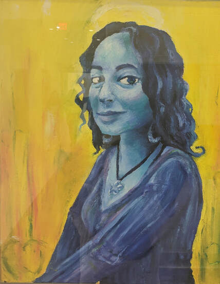
This will be a reflection on the piece because I did not do a palette knife landscape like the other peasants in the class. I am glad I didn't. It would have been stupid. But here is my wife, Amaya. I wanted to paint her because she is my muse. I wanted to use some funky colors for her so I used cool colors because she is cool. The background is yellow because yellow is the color of the sun and Amaya is my sun. I think the contrast between the warm and the cool colors is nice. You can see hearts around her because I am LOVING her. There is a halo above her head because she is an angel. I tried to capture her face and I think it is recognizable as her. I included some texture in her sweater and in the background. This was my first time using palette knife for a whole painting and it was not that bad. I enjoyed it and it was a unique experience but I think I still enjoy using the brush a lot better. I tried to really show all the shadows and highlights in her face and hair. The necklace was probably the hardest part and I would try to redo it if I cared enough. I am simply having a wonderful Christmastime. Also the final picture has a reflection in it because I forgot to take a final picture of the painting until it was being displayed. OOPS!
|
12/1/19 - Ordinary to Extraordinary
|
|
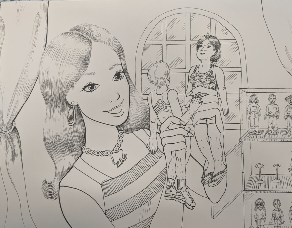
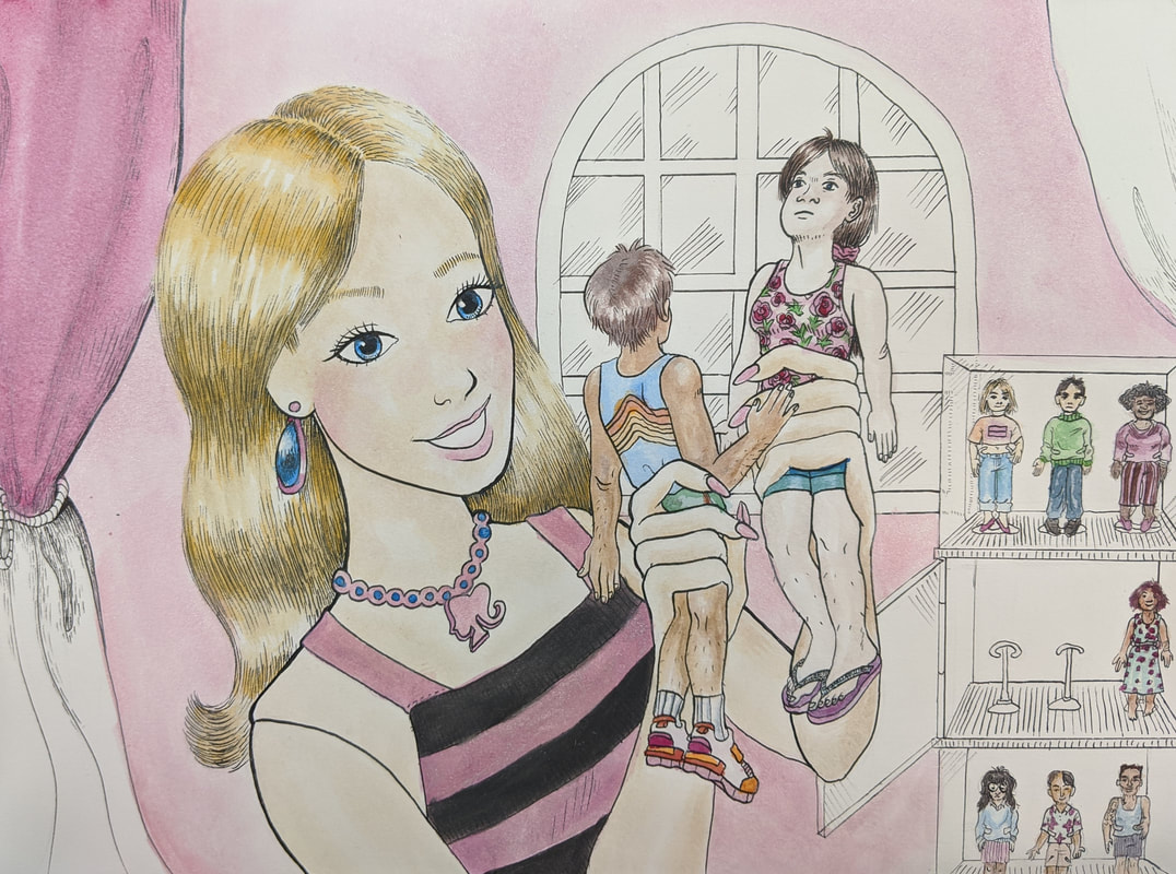
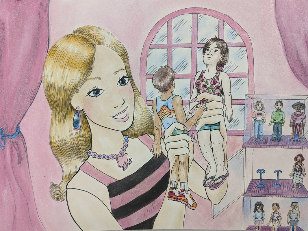
I had a few wacky ideas for this project. One was to have fish feeding humans that were swimming around in a bowl. I went with the same theme of role reversal and decided I wanted to draw Barbies playing with humans, cause I was just in a Barbie mood for some reason. I wanted to do it in pen to switch it up from the painting and Prismacolor I usually do. Last minute I decided to put inks on top as color. The experience with that was fine but it was my first time and I wasn't really taking my time so I made a lot of mistakes. It was challenging to make the pen lines look how I wanted. In a lot of places where I had to do long lines they are really shaky or wobbly.
The big thing I wanted to make sure the viewer could tell was that it was Barbie playing with humans and not just a random lady looking at human-like dolls. I drew from a lot of different Barbie appearances to try to make the most recognizable Barbie possible. The pen sketch I did looked awful cause I made Barbie look like her eye was melting off her face, so I was scared to do it on the final project. Fortunately I'm actually pretty proud of her appearance on the final and I think she is definitely recognizable. Another big thing was making |
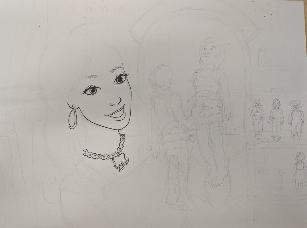
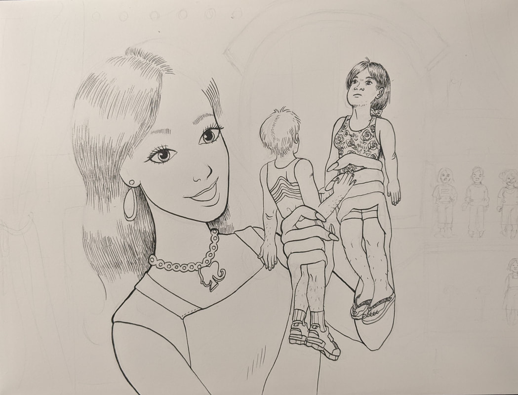
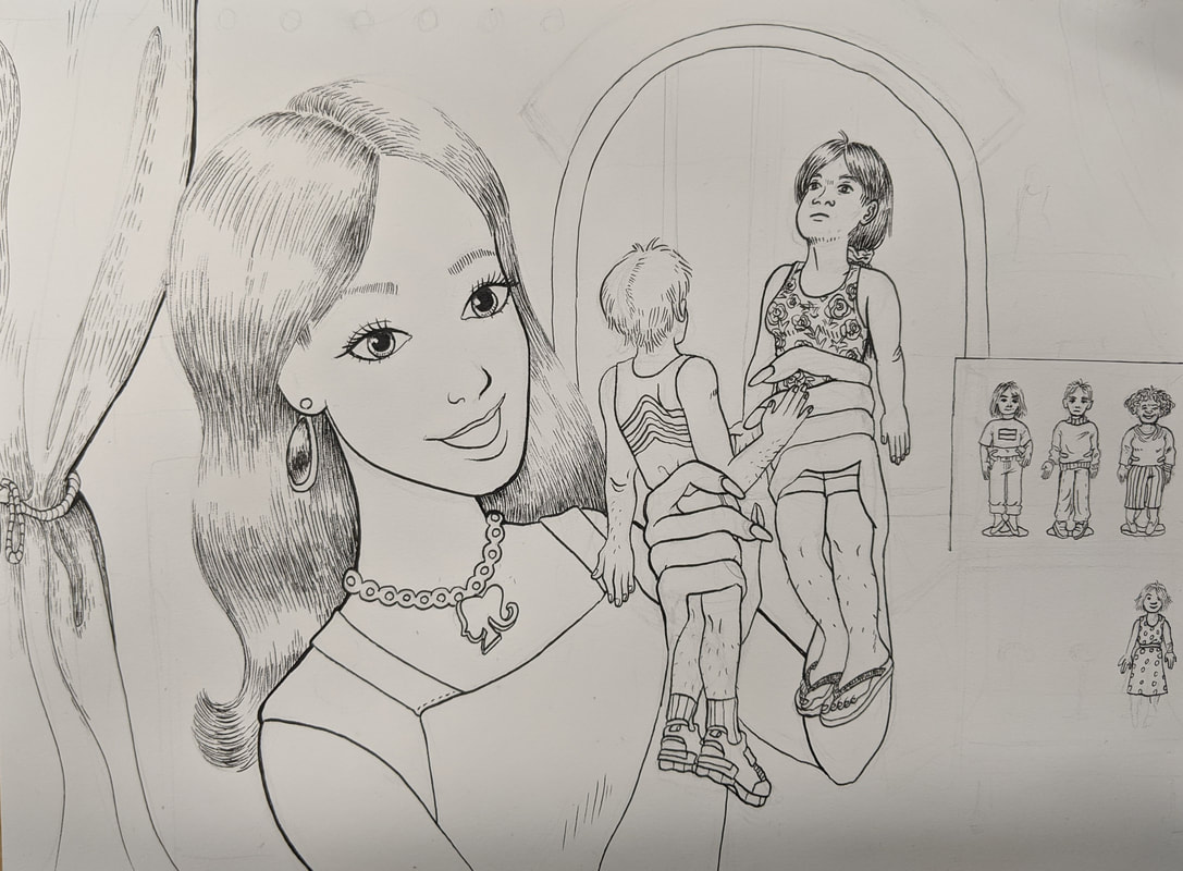
|
Barbie's appearance significantly different from that of the humans she is playing with. I made sure to show Barbie's doll joints in her shoulders and her cold, unfeeling eyes, while showing the humans with a lot more imperfections and no doll joints. You can't really see it in the photo but I did Barbie's colors with fluorescent, sparkly India inks, while the humans have more muted, normal colors. I decided to put in the display case with all the other humans at the last minute because I thought it would help if you could see more humans that Barbie owned.
If I did this project again, I think I would put some kind of pattern on the walls behind Barbie to make the drawing look more full. I would also take more time with the inks, use smaller brushes, and try not to make as many mistakes as I did with this one. Overall I think I like how it turned out. Maybe not the background as much, but definitely the foreground. |
11/20/19 - Interior Spaces
|
|
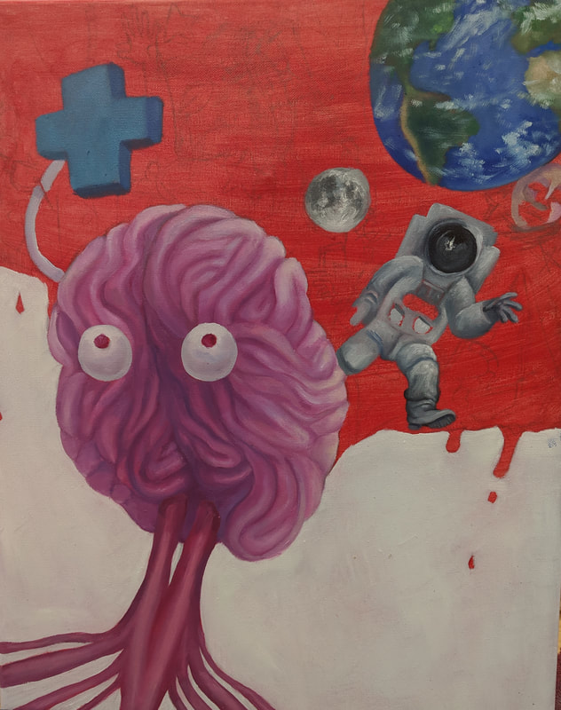
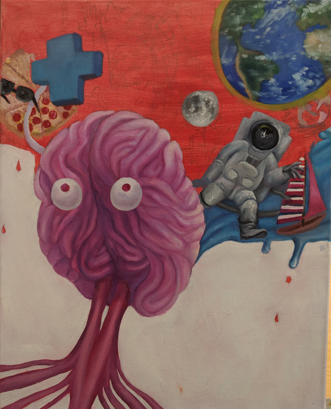
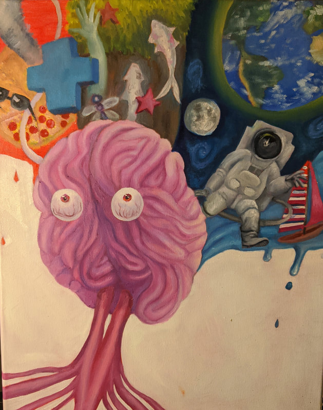
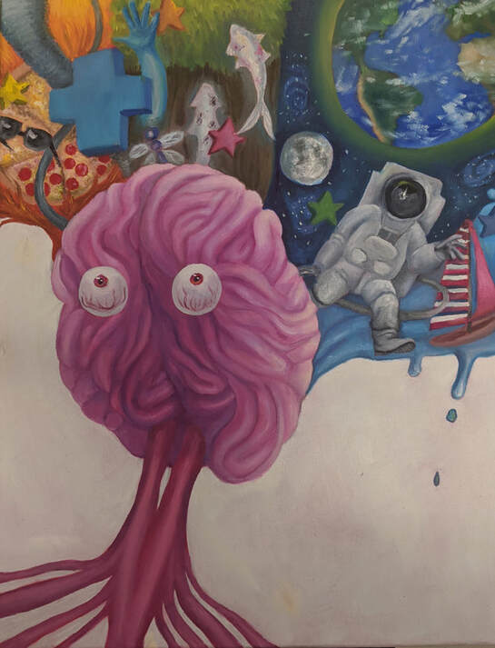
For this project I tried to think of unconventional interior spaces. My first idea I was kind of attached to was making a really dark painting of glowing koi fish inside a bathtub. For my other main idea (the one I ended up using) I wanted to show the inside of a mind. I settled on a mind exploding outward to show a bunch of random stuff, with eyes and a nervous system along with the brain to also show the interior of the body, sort of. I had a difficult time making the colors and I wished I had tried to make them more vibrant like in the marker sketches I did. I also had a difficult time showing the smaller details. I guess I had never really tried to do that in oil as much before. I am still trying to get better at oil painting, but I think there are some portions of the painting that I really like my work on, like the astronaut, the koi fish, the moon, and the plus sign. The brain could use more work in some areas but it was fun to paint all the folds. I dislike how the eyes turned out and wish I could do them over. With the composition, I wanted to draw attention to the all the stuff exploding outwards at the top, with a perspective looking upwards at the brain. Because I wanted to draw lots of attention to all the details at the top, I made the background white. Looking at it now I think I should have done another white
|
|
coat or put some sort of spiral in the background to make it look less empty. I don't really like this painting, I think it came out very amateurish. I am still trying to learn oil and I guess this painting was good for helping me to practice and gain experience, but I still have a long way to go.
When creating the piece, I tried to make a lot of contrast with the shading, so that all the details would really pop. I think I did okay with this. When I paint I have a tendency to just add random colors and blend on the canvas so it can kind of come out weird. I tried to avoid this with this piece by adding some more precise details later on, but you can still see mistakes in some places, like in the sailboat, which looks really bad, and the stars around the the painting. Because my marker sketch was kind of imprecise about what exactly was coming out of the brain, I had to make it up as I went along. I decided to divide up the backdrops of the exploding stuff to be different elements. So from left to right, I did fire, earth, air (or space, I guess) and water. The objects in each section are loosely related in different ways to the background. Obviously the astronaut, Earth, and the moon are all related to space. The sailboat is in the water. I put the fish, the dragonfly, and the hand in the Earth section because they are all creatures (the hand belonging to a human) inhabiting the Earth. So it was sort of like a "natural world" thing. The fire stuff was all different interpretations of the fire theme - the pizza could be spicy in flavor, the tornado causing destruction like a wildfire, the sunglasses belonging to someone who is "on fire" as in cool or something. I guess the plus sign could be interpreted a lot of different ways. Like someone adding to their wealth or score is "on fire" as in, getting a big combo. Yeah. |
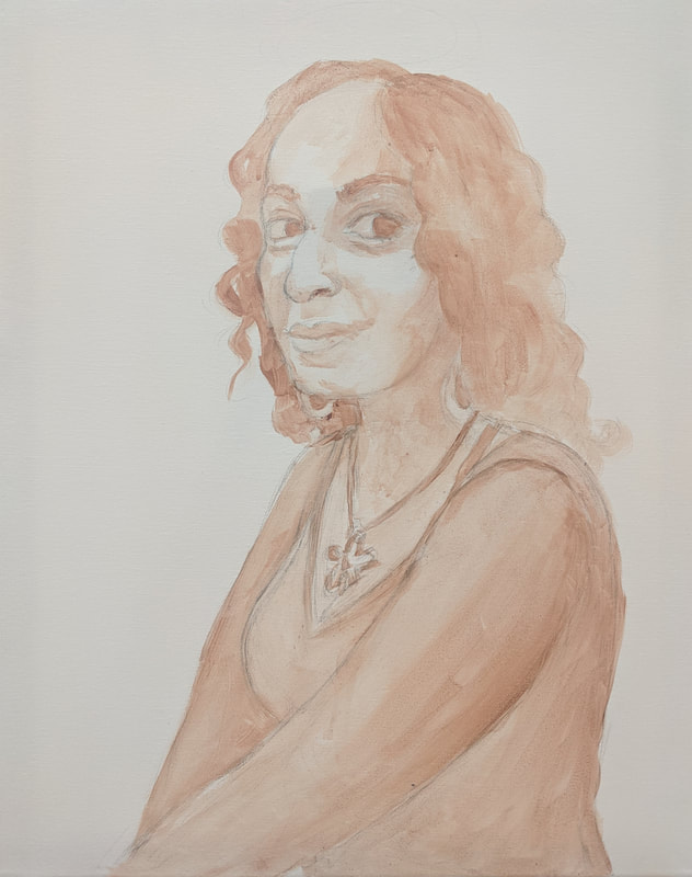
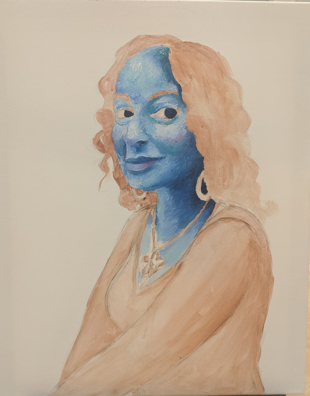
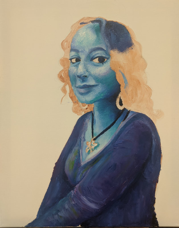
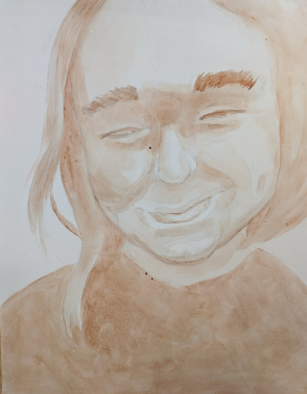
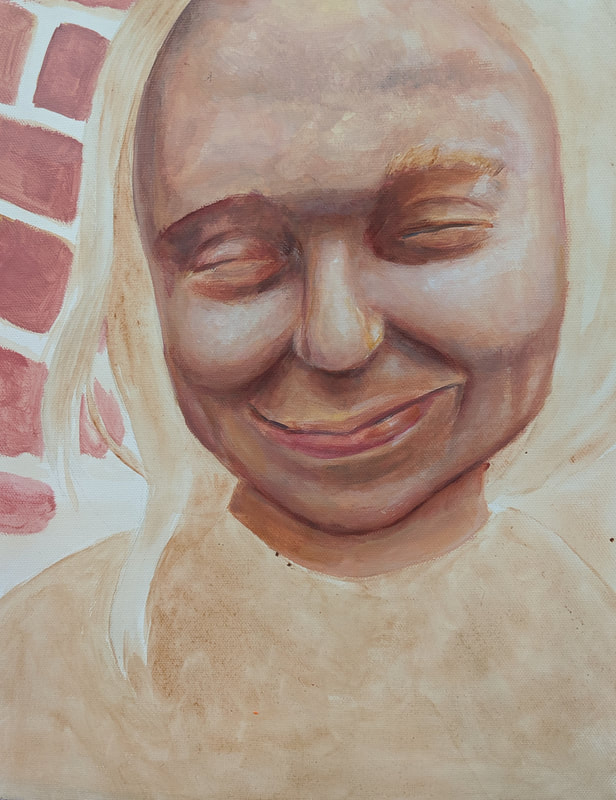
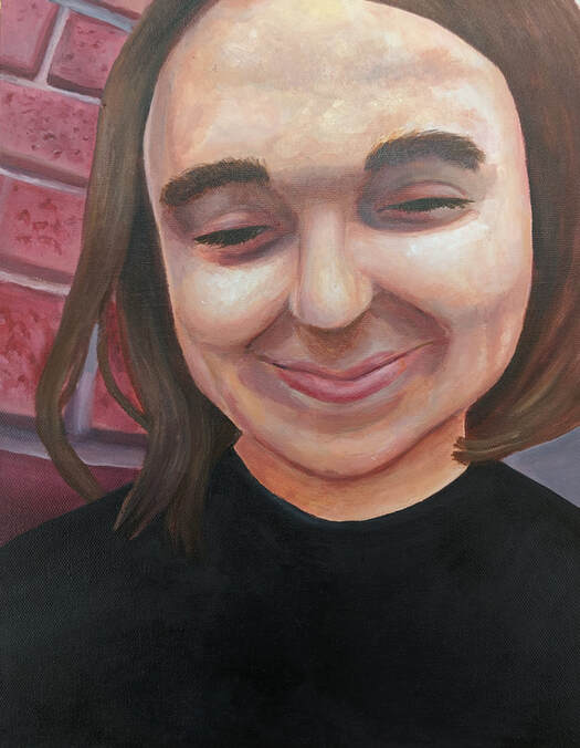
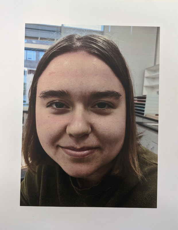
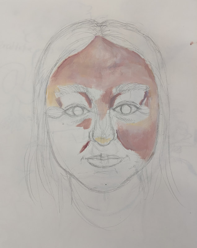
10/11/19 - Acrylic Self Portrait
|
For this project we had to paint ourselves realistically based on a photo. Painting myself with acrylic was super challenging. The last time I worked with the medium was in Art 2. It was difficult to get smooth value transitions when the paint would dry so fast. I also had a lot of trouble getting realistic skin tones. Often they would turn out too pink or purple and not look right. Painting smooth lines was also really hard and I'm not sure I entirely succeeded at that. I'm not a great painter but in terms of my skill level, I think this piece is pretty successful. First of all, it looks like it's me in the painting. It doesn't look exactly like the reference photo but you can see where I was coming from. First, I put down the brown under-painting, where I just mapped out where all the features should be. Next I worked on the skin, first putting down the shadows and then trying to smooth everything out in additional coats. This was probably the most enjoyable part because I really enjoy painting/drawing skin on faces. There's a lot of different crevices and undertones that make it fun. Next I did my shirt and my eyelashes and eyebrows. I thought the eyelashes and eyebrows would be difficult but I actually think they turned out really well. The background was next, then i did my hair last. I dislike painting and drawing hair and I think the bottom part doesn't look good in terms of how I depicted it. However, I do think I recreated the shine and texture in the hair pretty well. Overall I still dislike using acrylic but I feel like I have gained some experience in it. The last time I painted a face in acrylic was probably
|
middle school, which is kind of sad, but it's cool to see how I've improved making the face more dynamic and the shading and colors more noticeable and interesting. My face definitely looked better after I corrected some original proportion mistakes I had made and it's not too hard to look at now. I liked the warm color palette I used. The finished piece does represent me pretty well and I think I'm proud of how I did with acrylic.
9/25/19 - Facial Anatomy and Acrylic Practice
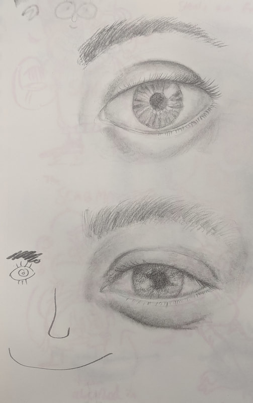
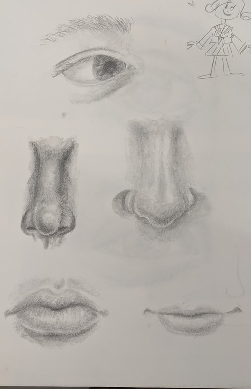
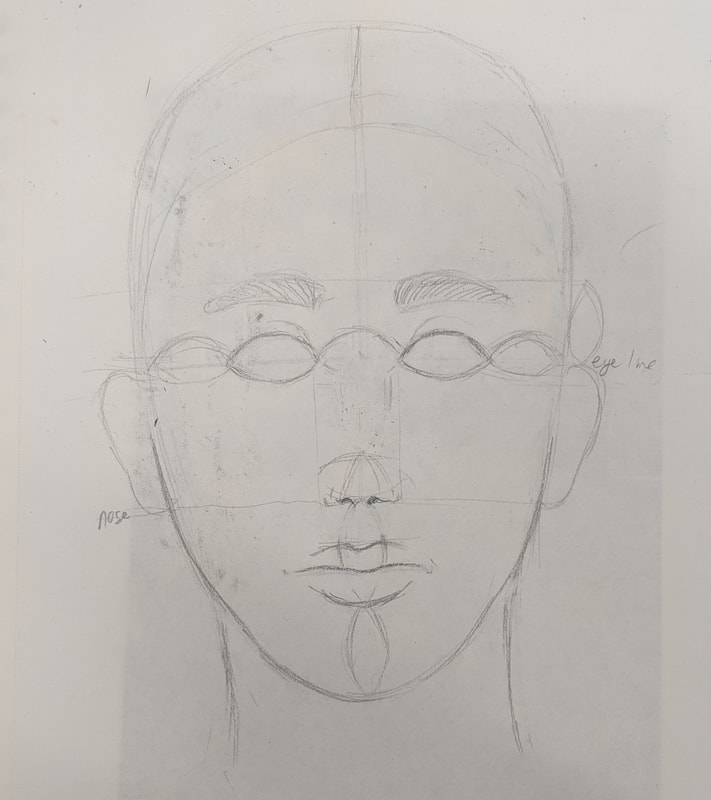
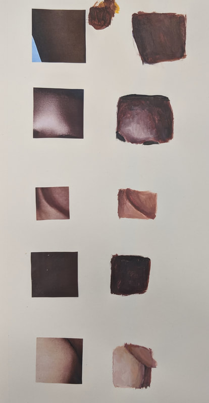
These were the facial anatomy and acrylic paint practices that we did. The lips are probably the best looking practice drawings. Drawing the nose was probably the hardest. The thing where we had to draw our face using the facial construction method turned out pretty well. I didn't finish painting it though obviously. The acrylic squares were super hard to do because I couldn't mix the colors. Acrylic is hard.
9/23/19 - Representational Reflection
Color Sketches
|
|
Final Piece
|
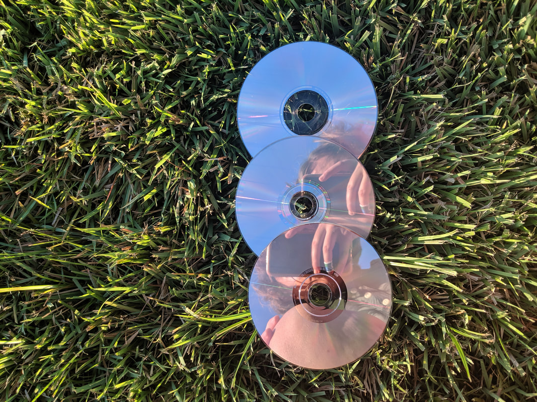
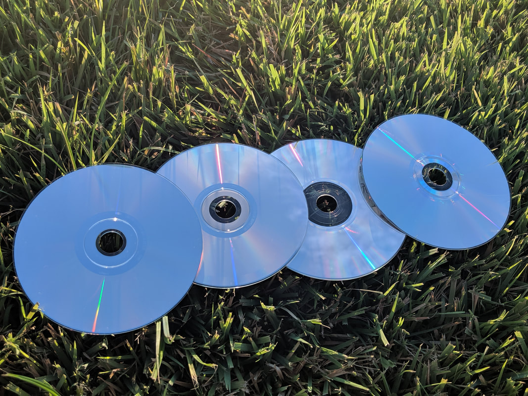
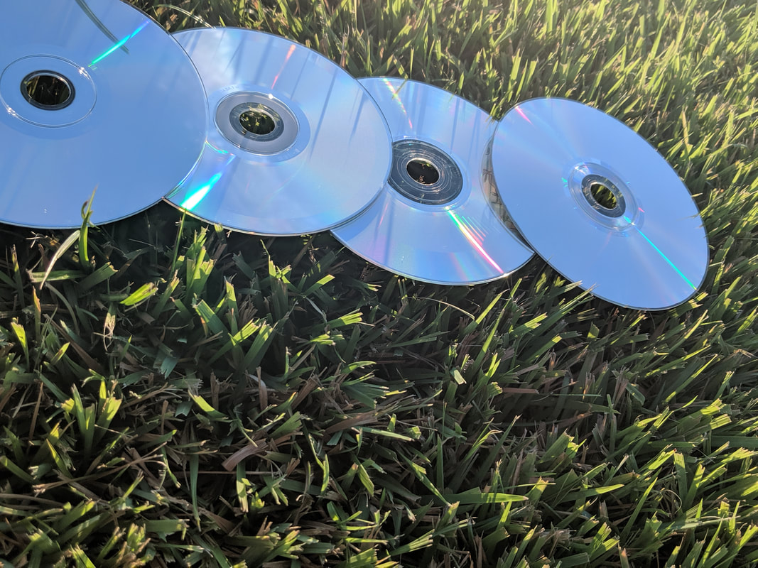
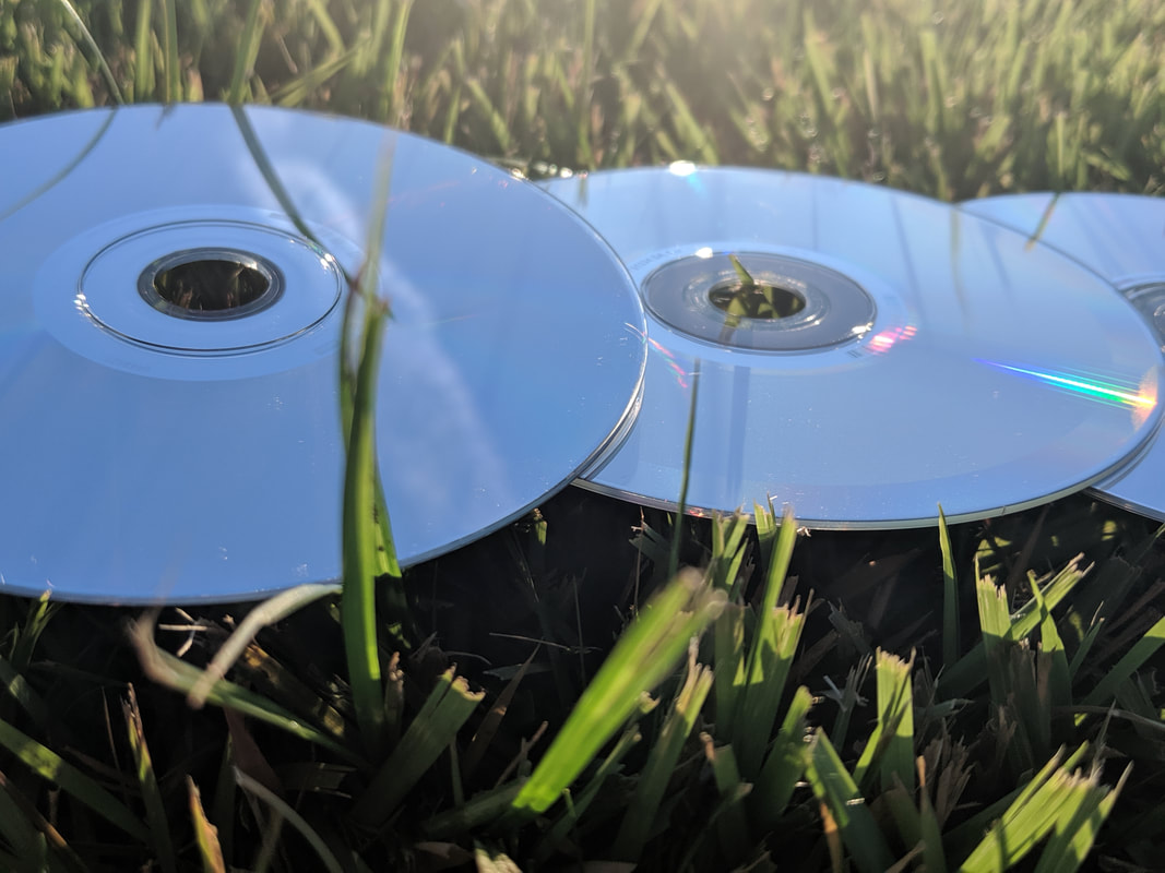
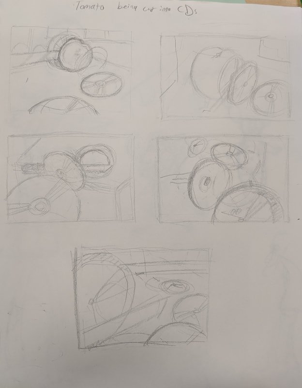
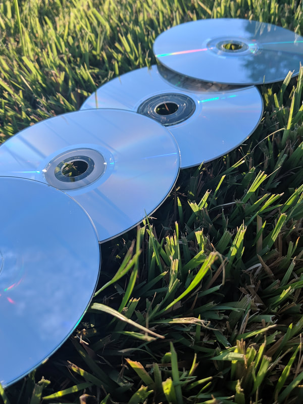
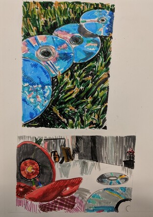
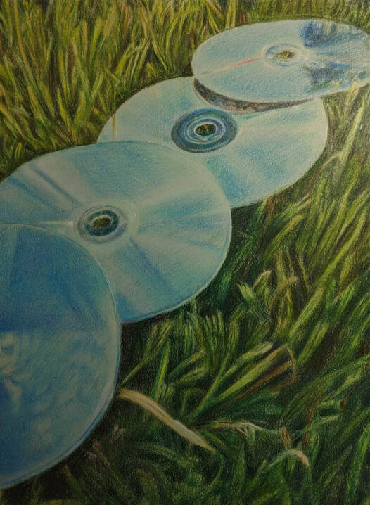
For my Prismacolor reflection piece, I had to brainstorm 20 things that reflected me and 20 reflective objects. I wasn't really sure what specifically I wanted to do at first. I knew I wanted to incorporate music somehow because it's super important to me. I decided I wanted to do something with CDs, because I enjoy collecting CDs and they also have a really nice reflective surface. Originally I wanted to do a somewhat surreal idea that involved me cutting into a tomato, my favorite fruit/vegetable/whatever, but the inside would be a CD. I decided not to do that idea when I couldn't get a good reference photo for it, cause I wanted it to as realistic as possible. Earlier I had taken a few photos of some CDs in my backyard that reflected the sky. I decided to go with that idea as I really liked the color scheme and composition. The first challenge I faced was drawing the CDs. Getting the disk shape in perspective was hard but I think I did a satisfactory job; you can tell they are tilted and/or heading away from the eye. The CD reflections were hard and they took a pretty long time, as there were a lot of subtle color differences that I had to show so that the viewer could tell they were reflecting stuff. The grass was an incredibly long and boring process. I had to rush it a little bit, as I finally finished this at like 4:30 AM, so I probably could have added a bit more shadow value in some sections. You can see a difference in shade between the reference and my final drawing, but I still think it turned out well. Other than that I think I did a good job on the color and reflections. I had never done something like this before in Prismacolor so it was difficult but the reference photo definitely helped. This helped me learn to portray different subjects in Prismacolor and to think outside the box when it comes to topics...I don't think anyone had done CDs before as a subject, but I'm glad I did it. The CDs and my backyard do reflect me pretty well.
|
8/28/19 - Prismacolor Practice
Reference Image
|
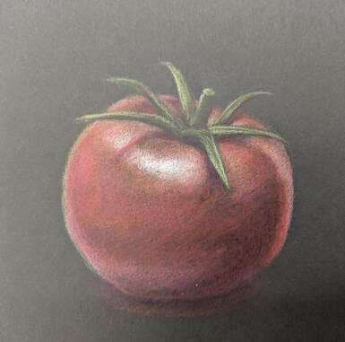
Prismacolors
|
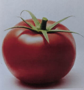
The assignment was to recreate a picture of a fruit or vegetable with Prismacolors on a piece of colored paper. I chose the tomato because they're great. I tried to incorporate purples, oranges, and other colors aside from red in the drawing to make it more interesting. I think the drawing would have showed up better on the lighter paper but overall the assignment was pretty fun and I am satisfied with the result.
